

On my first pass through the 2008 Carnegie International, the massive, just-mounted edition of the 112-year-old international art survey that runs through next January at the Carnegie Museum of Art in Pittsburgh, I eighty-percent hated the show. It started with the forced theme, "Life on Mars"–the first time ever that the show has had a separate title and theme–which seemed just a tad mundane for this event. Then it went to the somewhat annoying tagline questions listed on the marketing materials associated with the exhibition: Are we alone in the universe? Do aliens exist? Or are we, ourselves, the strangers in our own world? Is there life on other planets? (What’s this got to do with art?) And finally it passed to the bulk of the art itself–works by 40 artists from 17 countries–which had little to do with any of the upfront hoohah.
But the hate pretty much stayed upfront. Some time before I finished my first walk-through two hours before it’d begun, I realized my initial impression was misguided. Beyond the buzz and spin, I came to appreciate that there were some eccentrically personal, intriguingly revealing, and beautifully intimate moments in this show. And so, once I much more slowly and purposefully passed through the exhibition a second time, I ended up eighty-percent loving the work in it. Having come to understand what these artists were quietly attempting to do–and not what the curator wanted us to think they were doing–I was occasionally enraptured and captivated by these artists’ eccentric visions and their personal and intimate practices.
It’s tough to pinpoint a single moment or work of art that changed my outlook on the International, my response being more of a dawning revelation than anything else, but there’s no better artist in the show that I can think to mention than Los Angeles-based photographer/filmmaker Sharon Lockhart. Her work, a series of revealing, full-length portraits of children, each between 8 and perhaps 12 years of age, was tucked in a narrow hallway back behind an elevator and near the Carnegie Museum’s film auditorium. These were titled as a composite body of work Pine Flat Portrait Studio (2005), after the community where the kids lived and which the artist had visited to make the work. The setting for each photo was spare–black backdrop, gray concrete floor–but something about the positioning of the subject–pictorially, emotionally, and narratively–lent volumes of meaning to each image. These kids were rich characters, worldly wise and emotionally mature far beyond what they should have been. Their expressions, so raw and open, unguarded and direct in confronting our gaze, not only nearly leapt from the picture plane to grab the viewer but revealed personality types that reflected our adult awareness of the world back on us. Each of these images is much the same in presentation, yet each is wholly unique. Just to describe three examples, in one a Tom-boyish dark-haired girl stands, mouth set firm, hands folded onto her hips as if she’s just finished washing the dishes, in a slightly amused, just-show-me-the-money sort of pose. It’s the look of the girlfriend you’ve just disappointed for the umpteenth time. Another boy stands with a worried look, one uncertain hand resting on hip like a college professor’s, and one leg forward and slightly twisted in the eternally ennui-laden pose of the artist (the paint stains on his baggy jeans are a give-away). Still another, smaller boy with short hair and gritted lips, his wiry muscles showing through his tank top, has mounted his hands defiantly on his hips as if to dare you to knock him off. Something you said must have really pissed this guy off.

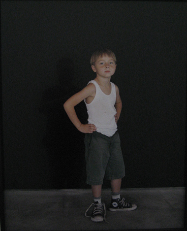
Lockhart’s images are all fascinating character studies, but the value of this work is not in seeing kids reflect the souls of troubled adults. Rather, it is in several secondary realizations. The fact that these are kids is always, meaningfully apparent beyond their surface poses. One of the tough boxer kid’s high top sneakers are untied, for example, revealing the childlike vulnerability and innocence beyond his defiance in an almost heartbreaking way. The cynical girl–hard-set as her look is–still walks in summertime bare feet and wears a shirt with a sparkly butterfly embroidered on front. These sweet, sometimes sad, always intimate portraits reveal worlds to us about the spirit of our times–the ways a troubled culture can affect even the youngest among us–and give us pause to think about our own lives. (Other portraits include a tense young blonde girl in a "Freedom" t-shirt, a precocious boy with a fake tattoo on his art that someone drew in ballpoint pen, and another boy in camo-shorts with a toy rifle hoisted over his head). We end up questioning, while looking at these kids, and because these are kids, in a deep way something about our own vulnerabilities and susceptibilities in a world gone slightly mad. This is like finding catharsis from the Depression-era Little Rascals, if those kids had been, in keeping with our own modern depression, slightly bipolar rather than full of madcap mischief.
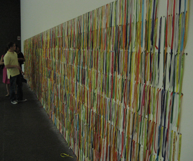
The best work in the 2008 Carnegie International reflects intimate, eccentric, often uncertain moments even as it hints at deeper and vast problems in the society. This is art of the resigned, pitiful shoulder-shrug variety, not of the noisy (and perhaps useless) hammer-thud variety–such as what was on display in such blustery recent shows as, say, the 2006 Whitney Biennial. Many of the personal and intimate gestures of these artists are designed, in fact, to spill out over from the private mind into a public realm, perhaps like pond ripples or a zen butterfly’s wings flapping or other suitable metaphor. Rivane Neuenschwander’s "I Wish Your Wish" (2003), for instance, is a mass of brightly colored, foot-long ribbons stuffed into rows of holes that have been drilled into the gallery wall. On each ribbon is printed a wish, such as, "I WISH I COULD CHANGE SOMETHING." Visitors are invited to take a ribbon and asked to wear the ribbon on a wrist until the object falls apart, at which point (according to a Brazilian tradition) the wish will come true. Visitors are also asked to write down a new wish on a slip of paper and push it into the vacated hole that held the ribbon. The new suggestions will be printed on future ribbons. In this way, via a perfect circle of wistfulness and want, the people will speak their concerns, and then other people will make the sacrifice necessary to make those wishes come true. There’s something sadly beautiful about such a self-feeding circle of wish, even though, of course, it’s an entirely useless gesture in practical terms. Still, futile as it likely is, it seems just as good as any other system anyone’s ever devised to change the world. Same goes with Mark Bradford’s act, in a seeming homage to the futile efforts of New Orleans flood victims to find assistance from someone, anyone willing to help, of placing the words "HELP US" on the roof of the Carnegie Museum–presumably so the Martians can send us succor.

That’s the thing about "Life on Mars." The work in it tends toward the useless, beaten up, or pathetic, and it is beautiful because of these aspects. Rosemarie Trockel makes useless, mock sleek-modernist furniture out of ceramic materials that, while inviting in look, is in reality hard and heavy and unpractical–a mockery of a person’s desire for comfort. Manfred Pernice creates a half-finished public works presentation of a mock highway br
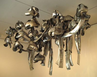
idge project, replete with half-painted vitrines, a highway diorama strewn with empty coke cans, pathetic photocopies haphazardly tacked to the wall, and a video monitor that is stuck on the start screen. Marisa Merz has made a lumbering, duct-system gone-awry, hanging sculpture out of pieces of old aluminum. It nearly fills a gallery space with a rough, hard-worn, and utterly useless beauty, looking like something pulled from the rubble of a collapsed modern high-rise. And Thomas Hirschhorn presents a survivalists’ grotto that has been created out of cardboard, packing tape, aluminum foil, and spraypaint seemingly by a group of twelve-year-olds.
All of these things revel in their failed attempts to make something meaningful, useful, and helpful. Indeed, their very poignancy comes from the very failure of the human hand to make something worthwhile.

There’s much more work in this show that, while not perfectly in keeping with my this theme of pathetic-but-beautiful human imperfection, is touching just for being somewhere between the small scale of human failure and the vast scale of preternaturally perfect. Vija Celmins’ small Night Sky paintings walk a line between uncomfortable human obsessiveness, and an absolute representation of the sublime abyss. Up close, the small touches and daubs of gray and off-gray paint on a blackish background fall apart into a tense battle with compulsion (each of these small works take multiple years to complete), while just a step or two away they seem perfectly realized visions of the ultimate beyond. Ranjani Shettar’s "Just a Bit More" (2006), meanwhile, is just as obsessive. Comprised of five net-like sheets of what look like green and blue beads connected by thread, on closer inspection these turn out to be hand-rolled and dyed daubs of beeswax the artist has fashioned herself. The surface effect is akin to seeing sea spray from a crashing ocean wave suspended in mid-air, but a viewer’s realization of the work the artist put into this evokes the harder, more humble notion of the common labors of humans to survive by hand fashioning tools like fishing nets. There are other instances of a human push-pull in this show: Haegue Yang’s beautiful geometric origami figures animated on a high-tech high-def computer screen to morph and merge into each other; Richard Wright’s massive gouache wall mural of a thousand directional triangle shapes spanning in curved grids from floor and onto ceiling; Richard Hughes’ strange wall painting of colors on top of each other that are then pulled back like torn wallpaper to reveal layers of color underneath in random patterns.

The only down-note for me in the Carnegie International was the quality of the painters included in the show. Most of these five or six artists seemed, likely in keeping with the pathetic human quality of the rest of the show, to be very unsuccessful at their medium. Their painting in general lacked any real expressive craft, approached in a senselessly slapdash way–like a candy-color Francis Bacon, or a less self-aware Richard Pettibon, or a glorified children’s book painter. And, of these, only Paul Thek’s work was variously poetic and rigorous enough to overcome its lack of technical skill. Still, in the end, loving eighty percent of any show is certainly about as much as you can expect, especially when it’s a show as varied, as heavily marketed, and as highly anticipated as the Carnegie International.
To learn more about what the curator for the Carnegie International was thinking as he organized the show, follow this link to "The Man Who Fell to Pittsburgh," a Q&A discussion between Douglas Fogle and Michael Fallon.
Leave a Reply Cancel reply