Author: Andy Sturdevant

  • One Day, One Night, Saturday's Alright

    AMONG THE GREAT unanswerable questions that haunt our city is this one: Why is there a giant, crappy K-Mart superstore sitting in the middle of Nicollet Avenue?

    For a city that is second-to-none in making catastrophic urban planning blunders, surely the decision in the late-‘70s to plop down a strip mall in the middle of one of the city’s most-used thoroughfares ranks as one of the most nearsighted. It has essentially created two different Nicollet Avenues in south Minneapolis: the fun Nicollet Avenue north of Lake Street that is full of bubble tea, brownstones, MCAD students and Asian fusion restaurants; and the crappy Nicollet Avenue south of Lake Street, where you go to drop off U-Haul trucks and test drive your new car tires to find out how well they deal with potholes.

    It’s on the latter Nicollet Avenue that Art Of This Gallery is located. While I shouldn’t write the neighborhood off as completely charmless – the Mexican place across the street isn’t bad, and there’s a great little vintage shop next door – the stretch of Nicollet Avenue the gallery is located on at 35th Street is pretty featureless. It’s a lot of vacant lots and generic mid-century beige boxes. Of course, it’s these sorts of unremarkable neighborhoods that afford the best opportunities for imaginative use of space – before the 1970s and 1980s, the Warehouse District was a gritty, post-industrial nowhere, and before the 1990s, Northeast Minneapolis was a sleepy, vaguely ethnic enclave with some terrifying corner bars and some very charming churches. Both these areas were full of pretty cheap, open, modest spaces that gave young emerging artists and curators room to try anything they could think of. Perhaps this slice of the southside, choked off from the cosmopolitan delights of Eat Street by bad urban planning, will spur similar practices in this decade. That’s how these things work. The practice of making contemporary art is so informed by real estate that they probably ought to teach land-use regulation in art school right between color theory and Joseph Beuys appreciation seminar.

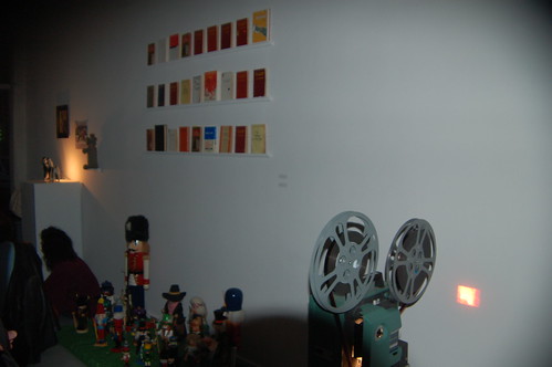
    Art Of This, a sort of odd name choice I always assumed must be a tribute to Peggy Guggenheim’s Art Of This Century, was started a few years ago near Powderhorn Park by a few local artists, and recently relocated to its present Kingfield location. Art Of This is, like the neighborhood in which it sits, modest – a storefront, a few hundred square-feet of open space, a basement with a bar and a small movie screen. But it’s hard for me to think of any gallery space in the Twin Cities that has so consistently in recent years devoted itself so wholeheartedly to recklessly passionate all-over-the-map programming. Perhaps the word "reckless" gives short shrift to the obvious planning that goes into each show, but every show I’ve seen there since the beginning of the year has been at the very least thought-provoking, and at best totally thrilling and strange and confounding in a way that makes me feel like I’m not quite living my life to it’s full potential, if that’s not, um, overstating the case too terribly.

    Even the shows that don’t completely work (I wasn’t a big fan of the Jo Jackson/Chris Johansen exhibition, for example) aren’t for lack of trying. Art Of This succeeds largely, I think, because whatever is happening in the space is always about the artist – the gallery is very neutral and unadorned, completely blank and with no architectural or design-related distractions, but it’s small enough to impose potentially-interesting logistical restrictions. Some contemporary art spaces, especially located in reclaimed buildings, can either give the artist a lot of leeway in providing interesting distractions to play off of, like odd fixtures or textures. Others are large enough in scale to impart a kind of monumental quality to work that may not totally deserve it. Art Of This provides neither of these qualities, physically. It’s the classic "clean, well-lighted place," as the art critic Dave Hickey memorably named his 1960s-era Texas gallery.

    This summer, the gallery has been using the space to positive effect to forgo standard multi-week programming in a series of what they’re calling One Nighters, a series of one-night-only openings that blend visual art, performance, video and anything else the artist brings to the table. There’s something appealingly ephemeral about this sort of undertaking, and maybe even a wry little dig at gallery-going conventions – who goes to shows after the opening night anyway? Like the Ramones used to say about their setlist, if you don’t like one song, you just have to wait around for two minutes and there’ll be a new one. You don’t like a One Nighter, there’ll be a completely new one soon enough. And regardless of whether or not you like it, you’ll certainly be moved to consider your values as they relate to art, which is something a worthwhile exhibition, large or small, will always do.

    Case in point: I wandered into Golden Energy, Heartland/Hardland‘s recent One Nighter performance-cum-thrift-shop-freakout, and after ten minutes felt half like a confounded old man (I believe my esteemed Vicious Circle colleague Michael Fallon had a similar reaction to their work recently), and half like it was time for me to strip down to caveman underwear and go running through Kingfield yelling lines from Wild in the Streets at the top of my lungs. How many recent art openings can you say that for? We can debate in the comments below whether inducing complete sensory overload is a valid aesthetic technique or not, but that night at least, I was sold.

    There’s several more planned for the rest of the summer and fall, including this upcoming Saturday night, August 16. A small group of Minneapolitans and Madisonians calling themselves the Rotarians Society, who seem to position themselves somewhere on the ideological spectrum between Mad Men and the International Order of Friendly Raccoons on The Honeymooners, will be making a presentation about a project they’ve been working on called "Tate Fabrication." It begins promptly at 7:30pm, and seating is limited.

  • Yes We Can!

    Bad design is all around us, but there’s no bad design like bad election year design. Let’s take a moment here to catalog some notable atrocities from recent election cycles, and then hang our heads in bipartisan shame. Offender number one is Bush/Cheney’s militantly mindless logo from 2004; you can almost hear the designer making phlegmatic war movie sound effects to himself as he drafted it. There’s Howard Dean’s bumper sticker from the same year – the one that actually had goddamn yellow crayon writing on it. I sent the good doctor a whole bucketful of cash and I still couldn’t bring myself to slap that thing on my car. The Kerry/Edwards ‘04 logo was so incompetently designed it looked like an advertisement for a personal injury attorney named "Kerry Edwards" (and not one of the better ones, either). As for this eyesore, which looks as if it belongs on a bottle of your dad’s favorite aftershave circa 1982, the less said, the better. The sad fact is most campaign materials look, at best, like they were designed by an adjunct professor of design at an unaccredited two-year evangelical college (which may well be the case in some of these campaigns). At worst, they just drip willful contempt for the viewer’s intelligence and taste.

    But think now for a moment about the material Barack Obama has been putting out in the last year. Start with that typeface the campaign uses on all of its official signage, a sans-serif called Gotham. It’s clean, assertive and streamlined. Regardless of your political or aesthetic inclinations, you can easily appreciate that it’s the kind of elegant typeface that you don’t really see in most political campaigns. Gotham was created only a few years ago by a prominent New York typographer, but it draws heavily on mid-century sources, and there’s resultantly an authoritative, timeless sense to it. It looks great and it’s highly functional. Gotham is a capital-M Modern typeface that carries all the cultural implications of Modernism with it – optimism, clarity, progress.

    I know that seems like a lot to pin to something as simple as a typeface, but in the current electoral visual landscape, Obama’s clean, simple design look downright radical, like it came from another world. It certainly calls to mind some of the more inspiring parts of our collective past, but not in a way that panders to baser reactionary tendencies.

    A show of New Deal art called By the People, For the People will be closing this weekend at the University of Minnesota’s Weisman Museum (you can read Julie Caniglia’s outstanding review of the show for mnartists.org). Seeing it a few weeks ago, I was struck by how much the work on display reminded me not of fireside chats and Woody Guthrie ballads, but of the junior Senator from Illinois. I doubt that it was a conscious decision on the part of Obama’s design squad to make explicit references to the aesthetics of the New Deal in his campaign material. But think of that Shepard Fairey poster that looks it like it came right out of an IWW print shop. Think of the explicit references to the American heartland in the campaign’s it’s-a-flag-but-it’s-also-a-farm "O." Even that ridiculous Latin-enhanced faux-presidential seal that the campaign trotted out a few weeks ago (and then promptly retired) bore a strong resemblance to the logos of FDR’s so-called "alphabet agencies" like the NRA, WPA and CCC.

    Throughout the show, I detected a certain philosophical, functional and aesthetic kinship between our era and this one – it’s all easily-deciphered, populist, progressive art-making practices in service of the civic good. I don’t know if it is Obama’s intention to suggest outright that he’s the direct heir to FDR’s high-minded hard-times liberalism (and his detractors would say he’s hubristic enough to do just that). But there is something stirring about his campaign – yes we can! – that owes quite a bit to the outsized optimism of the 1930s, and a lot of that has to do with the aesthetic decisions Obama’s campaign and his supporters have made.

    Much of the work in the Weisman show was created by obscure regional artists working under the auspices of the WPA Federal Art Project, another one of those alphabet agencies that put American artists to work capturing the Great Depression on paper and canvas. I should say rather that many were obscure at the time, and then went on to have very successful careers later. But most did not; most were artists that were paid to do a job well, and went out and did it. As you might expect with work of this nature, it really ran the gamut in terms of quality. Some of it was very staid and workmanlike, some of it was quite distinguished. What was most remarkable about all of it, though, was the uniform clarity and toughness throughout with which the subject matter was depicted.

    The Great Depression battered America in a way that makes our recent economic troubles seem piddling by comparison, but there is a sense to all of the artwork that America is perfectly capable of drawing on its strengths and pulling itself out of unimaginably difficult circumstances. It’s a broad coalition of regular people, too, that will step up to carry out that task, the kinds depicted in the work – miners, laborers, scientists, factory workers, sharecroppers, truck drivers, builders.

    The Weisman show reminds us that artists, too, were a part of that populist coalition. With the death of Jesse Helms this month and all the editorial hand-wringing that has followed regarding the late Senator’s one-man crusade against contemporary art, we forget that artists could ever be a part of a broad-based populist coalition. And yet there they were, being paid to document the troubled times in which they lived and aligning themselves not with the elite and the influential, but with the dispossessed and the downtrodden. Granted, the work they made was not always popular with those Americans it depicted, and the kind of s
    ocial realist art the WPA produced is often bogged down by the struggle between the high-minded principles it espouses and the difficulty and grittiness of the subjects it depicts. But thinking back to those pre-Culture War times and considering that talented artists would be permitted, and even encouraged, to engage in such a dialogue – well, that’s what seems most surprising and satisfying.

    One of the best surprises for me in the show was a photograph of farm laborers by Ben Shahn, the much-admired mid-century painter and printmaker. Shahn was the kind of old-school Brooklyn Jewish left-wing artist that the Obama campaign, for all its talk of inclusion and progress, would probably take great lengths to demographically disassociate itself with – too radical, too East Coast, too "elite"! I’d had no idea Shahn was out there in the field snapping photos for the Farm Security Administration, but there he was, right next to Dorothea Lange and Edward Weston. Would an Obama administration give a contemporary Ben Shahn, an artist with demonstrably leftist sympathies, the opportunity to get out there into the heartland and create art? Would a contemporary Ben Shahn even want to undertake such an endeavor? Hell, are there even any artists left in his adopted neighborhood of Williamsburg making political art?

    Obama’s campaign has been a fascinating one to watch. At times I have felt (a) like it seemed too good to be true, (b) like it was the true last hope for whatever might be salvageable of the American dream, (c) like the whole thing was hopelessly personality-driven and vaguely demagogical, (d) like Obama might be the only major political leader in my lifetime I could get genuinely excited about, and (e) like it was all noble sentiment and erudite speechifying with no real call to sacrifice and action – often all of these confusing sentiments within the space of a week. Many Americans on both ends of the political spectrum also felt the same sort of ambiguity about Roosevelt. FDR’s harshest critics went so far as to decry him as a Fascist, a charge that has recently been unearthed again in two recent books from both the right (Jonah Goldberg’s phenomenally stupid Liberal Fascism) and the left (Nicholson Baker’s elliptical account of the lead-up to WWII, Human Smoke).

    When we look at this moment in time from a purely aesthetic perspective, it seems to me that we’re looking at a mainstream progressive movement that values good artistic practices and welcomes artists back into the fold, for perhaps the first time since the New Deal. In fact, one of the minor planks in Obama’s long-term plans is the creation of an "Artist Corps." Would the Ben Shahns of 21st century Williamsburg clamor to join such a movement for the good of the nation? Before you answer with a flip remark about the callous solipsism of the youth of America, it’s worth visiting this gallery of Obama-specific street art, which runs the gamut between officially-sanctioned campaign iconography and totally wacky guerilla work. Compare it to these beautiful specimens of WPA poster art. Even if Obama’s cult of personality is a bit overemphasized at the expense of the broader issues in much of the newer art, I would say the aesthetic, functional and ideological parallels are readily apparent, and the comparison on all counts is generally favorable. It looks, at very least, like the opening arguments in a long overdue national discussion over what role art is going to play in contemporary political engagement. That’s something worth getting fired up and ready to go about.

  • The Paintings Have Been Drinking (Not Me)

    Travel back with me, if you will for just a moment, to those happy, halcyon days of the year 2001. Oh, what a time to be a young American artist it was!

    The world waited breathlessly for the final bombshell in Matthew Barney’s Cremaster film cycle to drop (spoiler: Gary Gilmore did it!), and your hipper, richer, better-looking friends were cashing in their trust funds and moving en masse to some sort of Italian-speaking suburb of Manhattan called Williamsburg. Fashionable young men were rapidly perfecting the art of ironic facial hair, and their female counterparts had finally harnessed the unstoppable power of the knee-high boots/vintage skirt/wrinkled Mogwai t-shirt combination.

    Oh, what a time to be a young American artist it was!

    Amidst all of this excitement and bustle, your humble correspondent was an apple-cheeked 21-year old BFA candidate in Louisville, Kentucky, learning the twins arts of oil painting and quoting Foucault in the course of casual conversation (the latter being a skill set I still have yet to master). Like the rest of my newly-legal art school peers, I typically spent one or two Friday nights a month out viewing challenging video installations and half-baked performance art in the upstairs loft of a decrepit Clay Street warehouse or a little Frankfort Avenue storefront (the former being a favorite target of the Louisville Metro Police Department for repeatedly violating local noise ordinances).

    What was it that brought me out to those openings, weekend after weekend? Was it the thrill of newness? The excitement of being part of a community? The chance to hobnob with successful young emerging artists? The opportunity to meet prominent local gallery owners eager to display my crappy paintings of cigarette butts?

    Well, sort of. But not entirely. Truthfully, I was there mostly because these spaces usually served free Falls City Beer at their openings. I expect many of my peers were also there for the same reason.

    Now of course this isn’t the only reason I went to art openings in college. I was there to see some art, too. But if you’ve been involved in the art world in any capacity, you know this scenario well. It’s not Louisville, but maybe it’s Northeast Minneapolis, maybe it’s Lowertown St. Paul, maybe it’s Chelsea, maybe it’s whatever the arts quarter of your college town was called; but wherever it is, you know it.

    This is one of the first magical lessons of college: dude, they totally have free beer at art openings.

    If it’s not free beer, it’s free wine. And if you’re lucky, it’s free liquor. If it’s not free, it’s cheap. And if it’s not cheap, your friend working the bar will slip you a cup anyway. The point is, if you have an artsy bent and like to have a few drinks in you, there’s no better place to be than an opening on a Friday night. Openings and alcohol go hand-in-hand, like Gilbert and George, like Andy and Edie, like Jeff Koons and the feeling of wanting to punch Jeff Koons in the face.

    I began thinking about this after some rumblings in a few art blogs last month following the arrest of New York gallery owner Ruth Kalb during an opening at her gallery in the East Hamptons. The charge was violating liquor laws and entertaining without a license. Normally the goings-on of the Long Island art world have little interest to me personally, but this is really a universal theme. How many art openings have I been to that have been shut down by the cops for this very reason? Not a lot, but certainly a notable handful.

    Moreover, how many openings have I been to where someone got a little too drunk on the house wine and wanted to start a fight outside about the relative merits of shooting digital vs. Super-8? Or where the gallery owners had to kick someone out for sloshing their drinks a little too close to the artwork? Or where the aftermath of the night’s festivities was a catastrophic scene of discarded beer bottles, crumpled plastic cups and sticky spots on the floor? More than a few.

    Then again, there have been the many times when I’ve thanked the booze-soaked ghost of Jackson Pollock that I had a little cup of wine to look at the art with. Openings can be awkward, stifling affairs. People go to openings to see art, sure, but they also go for a multitude of non-art related reasons.

    People go to openings to see who else will be there. People are there to impress their friends and confound their rivals.

    People are clustered in unnatural little conversational groups – you’re spending a half-hour talking to that sculptor whose name you never remember, an adjunct professor you once had, your younger brother’s fiancée and that girl that works at the co-op, all at the same time. None of them have met each other. They all expect introductions.

    People are nervous. People want to look good because they may be photographed by The Minneapoline and get their pictures on the Internet. People want to look good because their ex-girlfriends will be there with their new, hotter boyfriends.

    Galleries can be stuffy and overheated in the summer and drafty in the winter, and a lot of the time it’s impossible to even see the art, much less form a coherent opinion about it because people are so crowded around it. If there is music, the music is loud and you have to shout over it. Even worse, the music may quite possibly be "experimental" in nature.

    You often have to seem smarter and/or cleverer than you may actually be.

    Needless to say, a little beer or wine in this context can be a godsend.

    It gives you something to look busy with if you’re by yourself, and gives you a little bit of impetus to talk to people with whom you might not otherwise think of much to talk about. It’s a scientifically-established principle that alcohol makes you smarter, or barring that, at least more confident about seeming smarter. Standing in front of a canvas with a little cup of wine in your hand feels right. It feels natural.

    From the gallery’s perspective, it can be helpful, too. It draws people in, for one. Healthy attendance numbers look good on those grant applications. If it’s a commercial gallery, a little libation gets people in the mood to buy. If the alcohol is donated, the gallery can even cover some additional costs in the process. No huge profit margins, obviously, but enough to make it worthwhile.

    I talked to the directors of a few Minneapolis galleries to get their take on the subject. Was serving alcohol at openings worth it? The general consensus, of course, was a qualified "yes." But within that consensus, there were a range of opinions. Everyone I spoke to wished to stay anonymous, for obvious reasons, so you’ll have to use your imaginations.

    There are some legal issues involved in serving alcohol, of course. Obviously, you can’t sell it without a license. Actually, legally, you can’t really even serve it without an entertainment license (you can read all the statutes yourself to your heart’s delight here on the city’s website). What you can do, though, is suggest a donation, and so this is the way most of the gallery
    owners I spoke to went about things. A lot of it really seems to be semantics – most galleries you’ll go to will have a posted sign asking for donations, and that covers some of the liability, anyway. Everyone was careful to stress that they run a clean house as far as underage boozing, outdoor drinking and slopped-out jerkiness are concerned. Young-looking types get carded, people aren’t permitted to wander around the street outside waving their beer bottles, and troublemakers get the boot. This generally keeps police and city inspectors away. As one owner pointed out, the cost of a license is a piddling little amount compared to attorney’s fees. Another even went so far as to regular hire off-duty cops to keep everything nice and legit for larger, more heavily-attended openings.

    Legal issues aside, there are also the behavioral and trash disposal issues. Most owners here, as well, had specific strategies for making sure people have fun without landing everyone in the drunk tank or the Broken Bottle Fight Injuries Ward at HCMC. Openings occur for a specific and set amount of time, end before the neighbors start complaining, and filter out collectively to neighborhood bars afterwards so people have somewhere to go and finish the conversations they started. Everyone I spoke to recycles bottles and plastic.

    Basically, all gallery heads reported back to me that their crowds, though they do love the beer and wine, are pretty reasonable, intelligent people that aren’t there to bankrupt the gallery, start fistfights or urinate Phillips vodka on the video art set-ups. Mostly they come to see art, meet up with friends, and generally have a good experience. The setbacks are far outweighed by the benefits. An art opening is, in the end, about the art – if it was just about boozing, all of our local gallery runners would be nightclub entrepreneurs instead. This is as it should be. Because let’s face it: Minneapolis, to her eternal credit, has much better galleries than it does nightclubs.

    So enjoy your beer and/or art this weekend, and just make sure the empty bottle makes its way to the recycling bin.

  • How Much is That Metaphysical Totem Pole in the Window?

    I was recently talking to a Minneapolis artist who was, as many Minneapolis artists of a certain generation are wont to do, rhapsodizing about the glory days of the Warehouse District art scene in the 1980s. Before it was home to a hundred thumping dance clubs and one of the most heroically awful franchises in the annals of professional basketball, downtown Minneapolis’ Warehouse District was a primo fine arts destination where one could live, paint and party in relative peace, on the cheap and with minimal interference from police, creditors and obnoxious suburban disco jocks. During that decade, there were a few dozen arts spaces which had carved out homes for themselves in the many spacious, abandoned buildings on and around First Avenue, and collectively created a little scene that carried on until the Target Center and the Federal Reserve muscled everyone out in the early 1990s.

    One of the most attractive aspects of a lot of the Warehouse District galleries, my artist friend went on to say, is that many of the best spaces were situated in storefronts. Storefronts are, in many respects, the perfect venue for an art gallery. They’re right on the street level and generally built all the way up to the sidewalk line in pedestrian-friendly parts of town, so they interact directly with passers-by. The windows encourage the viewer to engage the art inside, creating a sense of (literal!) transparency into the gallery’s inner workings. Storefronts are usually fairly cheap to rent and maintain, and modest enough in size that an emerging artist can focus their work in a clearly-defined space without having it be completely overwhelmed by cavernous ceilings or an all-consuming sea of white drywall. Art museums and more prosperous established galleries can seem citadel-like and exclusive – think of the MIA’s imposing neoclassical façade, or the Weisman’s metallic tangles sitting up on that river bluff. Storefronts, on the other hand, invite the casual person on the street to peer into the window and come in for a plastic cup of wine. They’re a fully integrated part of the city, and if they’re sitting next to a taquería or piano repair shop or discount plumbing service, all the better for that elusive "street life" your urban planner friends are fond of chattering on about.

    So theoretically, the most perfect way to interact with the community would be to strip down the storefront gallery to its most basic essence, and eliminate all the superfluous elements so that you’re left with just a front window. That’s the concept, anyway, behind south Minneapolis’ Shoebox Gallery, where the idea of the storefront gallery really is distilled it to its most basic essence. The Shoebox, run by artist Sean Smuda out of his upstairs apartment, is almost literally just a shoebox: an 8′ x 8′ display window on the Chicago Avenue side of Roberts Shoes on Lake Street (you know, "hardly a foot we can’t fit"). The window is two feet deep with drywall backing, and that’s it – minimal lighting, no floor, no front door, and certainly no wine and cheese table. When there are openings or performances, they happen out on the sidewalk on Chicago Avenue. It fulfills the basic democratic promise of an alternative arts space in essentially making the city itself a physical part of the gallery.

    The Phillips-Powderhorn neighborhood in which the Shoebox is located has come a long way in the last couple of years – an early opening was interrupted by an on-street five squad-car drug bust – but it still isn’t an area that one would tend to think of as an arts Mecca. Artists had lived in the building for several years, but there was no real sense of interaction between them and the community at large. When Smuda moved into an upstairs space in the Roberts Shoes complex six years ago, one of the first ideas he had was planting some traveling vines in a problematic, crime-ridden back alley to add some green space. He then went about installing a video camera back there and looping the footage in one of the store’s display windows 24 hours a day for public viewing – putatively to monitor the growth of the vines, but also to reflect the everyday life of the neighborhood back on itself. X-Ray Alley, the first show at the Shoebox, went live in July, 2003. Indeed, criminal activity in the alley dried up almost immediately, and the owner of Roberts asked Smuda if he wanted to continue to program art in the window on an ongoing basis. He and early contributor (and current UofM printmaking professor) Jenny Schmid dubbed the space the Shoebox Gallery. It has been going ever since.

    There are, of course, certain inherent limitations to running a gallery in such a space. Potential exhibitors are presented with a checklist of every conceivable calamity that could befall a piece of artwork: the space is uninsured, in direct sunlight much of the time, separated from the outside world by a mere sheet of plate glass, and alternately furnace-like or freezing, depending on the season. Moreover, it’s run by Smuda out-of-pocket, so work must be shipped by the artist at their own expense. Despite these limitations, Shoebox has consistently shown strong work by well-known artists and performers such as Schmid, Xavier Tavera, Alexa Horochowski and Emily Johnson in the last five years. The current show by Tynan Kerr, Metaphysical Totem Poles, is a charmingly ramshackle collection of art objects obsessively cobbled together from paper scraps, geometric shapes, photos, found text, wood, brick and paint. They look, sitting in the window, as if they could be the remnants of a fire sale for a psychedelic shamanistic wholesaler. Kerr left a number of his colorful, garish paintings on wooden panels outside the gallery, which over the course of the show have disappeared from the sidewalk, absorbed into the bustle of the gallery’s surroundings – who knows what southside bedroom wall they’re presently decorating? The line between the gallery and the environment it interacts with is blurred further.

    For the gallery’s fifth anniversary, a group show called Beautiful Deleuzers/Guattari Hero, based on the writings of post-war French philosophers Gilles Deleuze and Felix Guattari, will be opening June 21 with a performance on the sidewalk by Kelly Meister. That’s the beauty of a storefront gallery like Shoebox. It serves as a counteractive measure against both the idea of fine art as something mystical and unapproachable, and the idea of the American city street as an alternately bland and disintegrating public space being choked to death by corporate greed, rampant crime and/or civic shortsightedness. The storefront gallery promotes the almost utopian idea that in the marketplace of ideas, Felix Guattari can exist right across the street from Wireless Toyz.