Author: Glenn Gordon

  • Crate 1 of 2 Opened

    It’s the middle of July and the melons on the fruit stands are sweet. I see a woman in a cotton dress, its translucence making visible the form of her body under the skirt. She is lovely. She isn’t stuffed into jeans; she’s wearing a dress of diaphanous cotton, compared to which denim is about as interesting, erotically, as sackcloth or sandpaper. The dress dances in the breeze. It dances around her, with her, because of her, and the extreme feminine grace of this gets to me in the pit of my stomach. Short of carrying her off on my bike, the only thing for it is to go cool out somewhere, so I do—I go to the Minnesota Museum of American Art to look at some art.

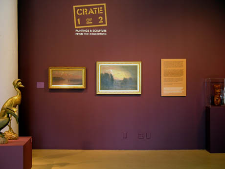
    The museum’s summer show is Crate 1 of 2, a selection of works from its permanent collection. The gallery walls have been painted a deep and luscious aubergine (that’s “eggplant” to you, pal) a color that for me evokes the vanished era of drawing rooms. I myself have never been in a drawing room, but from novels I know that they were peopled with brilliant conversationalists and beauties listening with heaving bosoms to pianists tossing off Chopin Etudes by heart. The aubergine of the MMAA’s galleries is tinged with nostalgia for that moment just before the crumbling of our civilization started picking up speed, say, a hundred years ago–before people took to saying “awesome,” and using the expression “closure” when talking about the death of their hamsters.

    Crate 1 of 2 is not a consistently great show, but it is a moving exposition of what it meant, not so long ago, to be a human making art in America. A good many of these painters and sculptors are no longer alive, and most of the works, exhumed from obscurity by the tender solicitude of the curators, are fated to return to oblivion at the close of the show. When the dead were alive, however—and this is easy to forget– they were as alive as you and I are right now, as driven by desire, as whipsawed by love and by hatred, hope and despair, innocent wonder and dreary ennui. The paint on their canvases has dried, but it was laid on wet by people not so different from us.

    Visitors to the museum sense this, I think, making their way from one work to the next like mourners slowly moving down a line to offer condolences; except that here it’s with unhurried pleasure, the way they lean in to look at a work, enfolding it into themselves, to sleep on it later. They take it in. Something is transacted across spans of time between them and the artists.

    Periods of art come as a succession of breaking waves. If you’re a full-immersion total hipster, each new wave obliterates all traces of the last. But as your own history lengthens, you see not only the next new thing and the next, you also see further back in time. One day, idly flipping through a magazine, you find yourself awestruck by pictures showing the images on the walls of the caves at Altamira and Lascaux. The past that you blew off as dead turns out to be not only not dead but more vitally alive than all the crap that’s on TV tonight. “The past is never dead,” wrote Faulkner. “It’s not even past,” a line often quoted when the present feels shaky. It keeps coming at you, each wave different but all essentially and eternally the same.

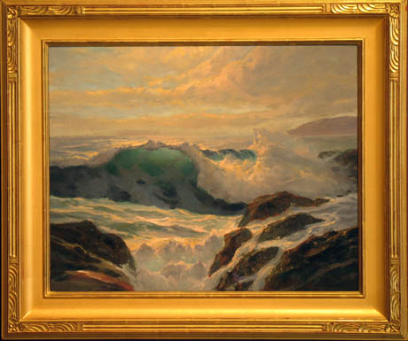
    One of the earliest and most beautiful paintings uncrated for Crate 1 of 2 is a seascape. Its focal point is a cresting wave, backlit and transcendentally translucent. The artist, Frederick J. Waugh, was so obsessed with capturing the form and movement of the ocean’s heaving swells and waves that in his long life he did something like 2500 seascapes. A photograph can nail the sea down with a click, but I don’t think Waugh painted to pull off quick raids on phenomena. I think he kept painting the ocean’s massive, surging volumes not to make the restless sea stand still but because, like his mind, it never would.

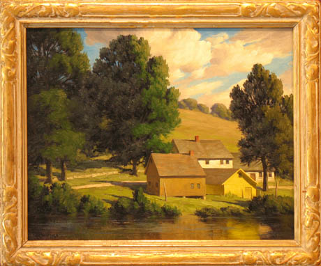
    Another early 20th century painting with the feeling of nature closely studied and absorbed before it is expressed is a farmstead scene by Bertram G. Bruestle. The light, somewhat like Edward Hopper’s, uncannily evokes an acutely particular moment of the day, not five minutes before or five minutes after. The painting is meticulous but not strangulated. Its fleeting light inflicts you with the ache of the ephemeral, the knowledge that an evanescent moment is dying even as it lives.

    A few mid-20th century abstractions are included in the exhibition, but the most interesting paintings in the show are more representational than not. William Meritt Chase’s society Portrait of a Lady,1914, might easily be mistaken for a work by his friend and contemporary John Singer Sargent. Right nearby, from 1906 and not quite so lofty, is a full-length portrait, conceivably the lady’s dressmaker, Modiste of Madrid, by one of the Ashcan school, Robert Henri.

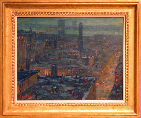
    From about the same time, but grittier, is a vivid aerial nightscape of Brooklyn by Earnest Lawson, another of the painters of the Ashcan group.

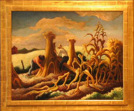
    Thomas Hart Benton is represented with a work done in his characteristically torqued perspective, 1945’s Shocking Corn, the cornstalks writhing in a way that strangely foretells the work, hardly more than ten years later, of his student Jackson Pollock.

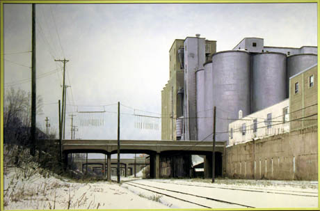
    Closer to the present and about as far from ab-ex as you can get is a large, satisfyingly bleak 1988 canvas by Minneapolis’ great master of what-you-see-is-what-you-get, Mike Lynch. The title is Elevator – 29th and Harriet. Features of this site still exist, but the scene as Lynch depicted it has since been transformed—it’s now a stretch of the Greenway. Stand on the same spot Lynch did on some cold, grey-blue day in February and, despite all that’s changed, you’ll appreciate the ethical and emotional precision of Lynch’s account of things as they are.

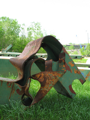
    Wandering in exile in its own city, occupying spaces like a hermit crab, the MMAA has had three homes since the nineties, first in the Art Deco Jemne Building, followed by a stay on the top floors of the Landmark Center, and, in the past few years, a provisional space in the old West Publishing Co. building on Kellogg Blvd, where with a shrinking staff they are valiantly continuing to produce exhibitions under tighter and tighter budgets. Too much of the museum’s collection sits in storage. No one can see it in the dark. Descending into the crypts, the curators have hauled out sculptures I never knew existed. Two of these (by Paul Manship) have the power to strike me mute, and among the rest are some that, though not great, nourish a hunger for something that’s lacking in so much recent art, something elementally human, something that doesn’t trade in irony and neurasthenic exhaustion and mistake that for cool.

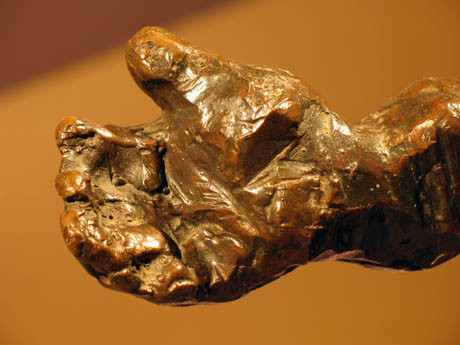
    One piece in Crate 1 of 2 that has this vitality is Jacques Lipchitz’s 1941 bronze, Arrival, a boisterous cluster of lumpy, exuberantly exaggerated human forms that pays homage to the groupings of figures in classical sculpture. At the same time, the sculptor throws off classicism’s tightassed restraint; the figures are unrepressed id, their hands meathooks, primal, like paws.

    In a similar spirit are two figure carvings in wood by John Rood, a self-taught artist, poet and
    musician who was a professor of sculpture at the University of Minnesota in the forties and fifties. One, carved from a single block, portrays a stolid and compact hardworking couple (1943) seated hunched and close together in a way that says they’re in it for the long haul. The other (1965) is a standing figure of a strongman, his muscles worn like slabs of armor. In both works, the direct, faceted carving makes you feel the force and conviction behind each stroke of the sculptor’s chisel.

    But what draws me back to this show again and again are two sculptures by Paul Manship. One of these is Briseis (1950), a work of the most naked and unaffected grace–a marble, of a whiteness and finish so soft that it is difficult to focus a lens on it. Briseis is a figure from the first book of the The Iliad, the widow of a slain Trojan. The introverted quality of her face speaks of her resignation to her fate, which is to be buffeted by the fierce contending wills of angry men. At the opening of The Iliad, Achilles is found brooding in his tent, refusing to return to battle. His king, Agamemnon, has claimed Briseis for himself. Achilles’ rage at having been made to relinquish her is the lit fuse that sets off the action. He is prevented from killing Agamemnon only by the intervention of the goddess Athena, who grabs him by the hair just as he’s about to draw his sword. Briseis is eventually restored to him. Run your eyes over this sculpture and you can see why Achilles, having been denied her, is driven nearly to murder. She is a lot to lose.

    Paul Manship was a son of St. Paul. He went on to bigger things elsewhere—the colossal, oddly awkward Prometheus that overlooks the skating rink at Rockefeller Center, for one–but he bequeathed a good number of his works to his hometown. Fourteen of them, including Briseis, are exhibited in this show. The other sculpture that gets to me at the core is his bronze, Europa and the Bull, dated 1924-1935.

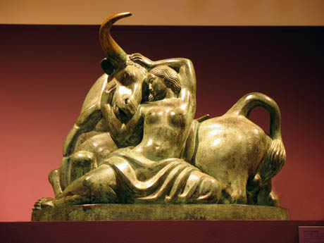
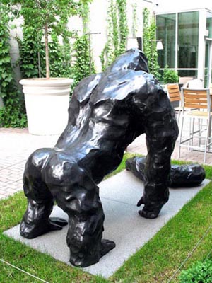
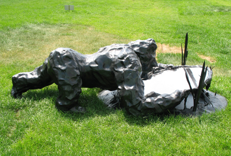
    Artists have painted and sculpted the story of Europa for thousands of years: Zeus, seeing Europa gathering flowers, is smitten. Deciding to ravish her, he assumes the form of a tame white bull, seduces her to get on his back, jumps with her into the sea and abducts her to Crete. Classically, painters like Titian and Rubens have staged the incident as a kind of water sport with a lot of accessory maidens and putti splashing about, but Manship took a different tack. He didn’t depict the scene by the shore of the sea, but the aftermath, the calm erotic satiety of the two as they rest against each other spent, pacified, content. Their quietly stylized faces, like Briseis’, are in keeping with a taste that developed in the Art Deco twenties for the symbolic devices of archaic sculpture: People are not sharply individuated, but given simplified, regular features, parallel waves of hair, the fabric of their garments draped in folds more neatly congruent than reality’s wrinkles allow. In a call-and-response of forms, the two figures in this sculpture encircle each other in love. Europa cradles the bull’s massive head—you can almost feel the gentleness of her hands on his forehead and jaw. His tongue lolls. His magnificent horns, in turn, all but embrace the gesture of her arms and protect her bared, open pose. He is on his knees, making himself smaller for her; she is splayed out, having given him all that she has. Throughout the sculpture are correspondences, the loop of his tail/the drape of her skirt; her arms/the curves of his horns; the parallel trunks of his neck and her torso, and so on, the more that you look. People go on about The Pieta, but the tenderness sculpted into the relation of the two beings in this sculpture–across species, no less—makes this the more compelling expression of love. For one thing, one figure’s not dead—they are both rudely alive. Driven by lust before lust got a bad name, I can see why Zeus carried her off. I can see why she let him.

    All photos by the author, shot with the kind permission of the MMAA.

  • Lyre

    There are certain works of art the body wholly understands before the mind kicks in with its distancing powers of disembodied detachment and analysis. In the Twin Cities, there is very little art in the public realm — in what we now call "the commons"– that does this. Most public art, strained through the cheesecloth of three or four bureaucracies, is earnestly mediocre, almost by necessity. Much of what wins competitions is "plop art," dutifully commissioned to meet the tithing requirement for one-percent-for-art public building projects.

    I can think of a few exceptions –not many– where viscerally beautiful works have come to see the light of day as public art despite the pitfalls of the commissioning process. One of them is the Heilmaier Memorial Bandstand, by the artist and architect James Carpenter, the bandshell with the saddle-shaped roof of glass on Raspberry Island in the river off downtown St. Paul. Another (right nearby, actually) is the powerful "Floodwaters," the roiling torrents of cast bronze flanking the southern gateway to Harriet Island Park, by Jeffrey Kalstrom and Ann Klefstad. Yet another, a work beautiful against all odds, is one that was never primarily intended as sculpture but turned out to be more compelling to the senses than many things currently called that. It is the new Martin Olav Sabo Bike and Pedestrian Bridge that spans Hiawatha Avenue and the light rail tracks adjacent to it, just north of 26th Street in south Minneapolis.

    The Sabo Bridge, named in honor of the congressman who secured federal funding for the project, is of a type known as a "cable-stayed bridge." Although they employ cables, the mechanics of cable-stayed designs are different from those of suspension bridges like the Brooklyn or the Golden Gate. A display panel on the bike path’s western approach to the bridge explains the design principle. From an engineering standpoint, a cable-stayed design presented the most elegant solution to the problem of spanning six lanes of traffic and two sets of light rail tracks without having to resort to intermediate support pillars in the middle of the road. The design wasn’t imposed on the site; it was inspired by the site’s constraints.

    The first time I saw the bridge was when I drove under it one evening at dusk a few months before it was completed. Its structural logic made itself understood on first sight. I felt it right away in my bones, sensing the forces working through and upon it the way people sense the rightness of the lines of a boat. Every one of the elements, the incredible back-bent mast, the deck, the fanned-out cables, the backstays converging onto bulwarks rooted deep in the ground, gave expression to the insight of the biologist D’Arcy Thompson that "structure is a diagram of forces." The bridge’s structure correlates with something internal, with one’s felt understanding of the structural mechanics of one’s own body. The sensation of it being in some way analogous to the way you yourself are put together tempts me to call the bridge a work of figurative sculpture-abstract, but nonetheless a human-figural representation of the forces and counterforces; metaphorically, of a tug-of-war; a stevedore hoisting a pallet aloft with a block and tackle, a puppeteer, a fisherman casting a fly. It is what it is –a bridge– but it triggers a chain of associations. It arouses the imagination in ways that few works of public art seem able to do, inert with virtue as most of them are.

    Call it a bridge or call it a sculpture, the new Sabo bridge is an inspired work, a piece of lyric engineering in the tradition of such masters of structural music as Santiago Calatrava, Pier Luigi Nervi, Eero Saarinen, and Frei Otto. Its elegantly tapered steel mast, backbent at an angle almost equal and opposite to the angle of its massive, similarly tapered concrete footing below the bridge deck, is a form sprung from the soul of Brancusi. The bridge is a stirring sight as you approach and go under the deck by car or light rail, and it doesn’t disappoint up close, when you walk or ride a bike over it. It is lovingly detailed: the workmanship in the steel and concrete is rigorous and clean, the care of the contractors readable in the panoply of the hardware, in the tensioning turnbuckles, tie rods, and railing cables, in the dramatizing spotlights mounted alongside the protective rubber boots on the ends of the bridge cables where they connect to the deck, in the backstay cables as their sinews converge in massive connectors to the concrete footings on the ground below.


    Cyclists in colorful gear flash across the bridge like shuttles of a loom. The balusters of the bridge railings are shaped with a bend like the mast’s. The railings themselves—the thin tension cables that pass through the balusters–are like the lines of a musical staff. They make the balusters read like the bars on a musical score, and a little like the frets on a stringed instrument, which in a way this whole construct is. The bridge is a lyre, a harp strummed by the wind. Reach over the railing and touch one of the cables that hold up the span. You can feel it thrum.

  • Pavane for a Dead Sculptor

    The melancholy in the eyes of the gorilla imprisoned in the zoo, I think it is real. He is confounded by the loss of his freedom. He sorrows at what his captors have evolved into.

    Minneapolis has two life-size bronze sculptures of gorillas by the late British artist Angus Fairhurst, who this past March committed suicide by hanging himself from a tree in a forest in England at the age of 41. One of them is in the courtyard of the Chambers Hotel at Ninth and Hennepin; the other is sited on the green outside the west window of the Walker Art Center.

    Fairhurst had a gift for imparting a brusque and powerful animality to clay, pressing life into it with his palms and his thumbs, building the figures in a way that I think gorillas themselves might do it if only they could. The bronzes are empathic. They make me feel what it is to be a gorilla, thickly stupid in some ways, surprisingly intelligent in others–not that different, in other words, from the condition of being a man. Now they are husks, all that’s left of Fairhurst’s struggle to inhabit his own body, a beast that in the end he could only subdue by choosing to kill it. No one can presume to say why.


    The gorilla in the Chambers courtyard is cordoned off and hemmed in by chairs and tables on all four sides. Fairhurst titled it, "A Couple of Differences Between Thinking and Feeling." The figure stands gorilla-style, the weight of its massive torso supported on the knuckles of its right hand as it gazes down upon its left arm, which–it is a shock to see–lies severed on the ground before him, lopped off like the limb of a tree. Looking at the gorilla’s face, it’s impossible to plumb what he’s thinking or feeling as he contemplates this part of himself that is no longer part of himself: Unspeakable pain? Detachment? Perplexity? Incomprehension? It’s hard to say, and, unable to cross the threshold of speech, he can’t tell us either. He isn’t even a faithful replication of a gorilla. The way the clay was worked, kneaded and pressed, formed into lumps and concavities, the surface doesn’t look anything like the hirsute coat of a gorilla. It’s closer to something like scar tissue or wads of putty, melted wax or clumps of tar. Every passage in the sculpting of it is evidence of an impassioned and playful hand, but the piece, in tragic retrospect, speaks of a man amputated from his own hope of connecting, the discounted instrument of his grasp lying inert on the ground.

    Crouched low on the lawn outside the Walker is Fairhurst’s other gorilla, this one rapt by the reflection of its face in a pool. His monumental hands grip the edges of the simulated pool of mirror-polished stainless steel as if to prevent the image from escaping his grasp. Every vector of his body says that his eyes cannot drink enough of what they see. Avid for the image, his body is tensed and alert-parallel to the ground but hovering over it like its lover, his whole force straining towards the object of its fascination, one leg advancing as though thinking of entering the pool.

    What does he see? His head is so close to the mirror that unless you get down on the grass to look up into his face you cannot see his eyes, only their reflection in the mirror facing the sky. The gorilla in the Chambers courtyard has no eyes to speak of; just sockets, almost as though he is too dim to have a pair to see out of. But this one, titled "The Birth of Consistency," sees, and is transfixed-it could be with horror, it could be he’s seeing the birth of Comedy, we cannot be sure. He is in the throes of the revelation of what is to follow, the next stage, the stage that will lead to us. Narcissus puts his lips to the pool; the image trembles, dissolves. Before he left this life, Angus Fairhurst cast in bronze all his longing to be one with it. It is a pity he is dead; until he stared into one too long, he was a mirror to the world.

  • Twinkle, Twinkle, Little Starchitecture

    Art museums are host to two species of rats, those that skulk in the basements, gnawing on the art in storage, and, lower on the food chain, the people who handle the art. “Museum rat” is trade slang for the stagehands, the workers who hump crates of art off trucks at the loading dock, maneuver sculpture into position, hang paintings, set up lights, build pedestals, perpetually paint and repaint the walls of the galleries, and generally do the bidding of the museum’s commandants. Museum rats are the movers, but not the shakers, of the art world. Most of them are artists of one sort or another themselves, which is to say, bust-outs and delinquents in t-shirts printed with the names of bands and film festivals you never heard of.

    During the nineties, I was one of that floating pool of feckless souls in the Twin Cities who get hired when a museum has two weeks to go before the opening of a show and too few hands to get the work done (the custom is to hire you for a stretch but then lay you off before you qualify for benefits or pensions). Most of my employment was at the University of Minnesota Art Museum, which before it transmogrified into the Frederick Weisman Art Museum consisted of a series of grubby galleries and offices strung along the fourth floor corridors of the moldering Northrup Auditorium. When the museum moved to its new quarters in Frank Gehry’s destroyer-class WAM–the crumpled sketch that served as the tuneup for the Guggenheim’s aircraft carrier in Bilbao–I was one of the deckhands, one of the crew who installed the billboard-size works by Roy Lichtenstein and James Rosenquist that hang in the front lobby and gallery of the museum. And it was I who with clammy male hands in white cotton gloves hung Georgia O’Keefe’s Oriental Poppies, said at the time to be worth two million bucks.

    One of Gehry’s early sketches for the Weisman, scribbled on a cocktail napkin and since preserved with the reverence accorded a holy relic, was seized upon by the museum for a logo, hoping with this to create a perception of the place as a hotbed of spontaneously combusting creativity. The with-it acronym, WAM, strives desperately for the same effect—POW! For all that, the place is basically just a gift shop (the first thing you encounter on entering the building) with a small teaching museum attached. Besides teaching students how to make purchases of tasteful gifts and stand frowning thoughtfully before works of art, the Weisman also makes money by hiring itself out as a catering hall for conferences, receptions, yuppie nuptials, etc. Often when I came in to work on mornings after one of these events, the floors of the galleries would be garnished with wet bits of wilted lettuce and little gobs of buttercream from pieces of sheet cake accidentally flipped off paper plates the night before.

    Gehry’s buildings, in my book, are architecture’s version of torn designer jeans. They imply radical experience without actually having to go through it. They gesticulate without it meaning anything. Inside the Weisman, the yawing walls reflect the gratuitously skewed planes and pointless curves of all the tin-snipped bling hung off the outside. In the museum’s carpentry shop, where I worked, the wall is canted uselessly inward; anything as sensible as a plumb wall would have been too mundane. I never measured to be sure, but it always felt like the shop’s longest dimension is the height of its absurdly unusable vertical space. The shop has no windows either—no eyes. . . it was like working inside a dumpster with the lid closed.

    Rhapsodizing over the Weisman when the building opened fourteen years ago, however, critic Herbert Muschamp of The New York Times pronounced the new museum’s galleries “the five most beautiful rooms in the world.” I rubbed my eyes to be sure I’d read this right, but this was before I understood anything about criticism’s contributions to the science of buzz. The process by which a work is pronounced great is compounded of many sidewise glances at what other people think. Gathering mass, the consensus keeps snowballing, burying us in an avalanche of conviction that such and such a thing is so -– it must be. . . someone more important than us said it is.

    It fell, then, to a couple of obscure museum rats, two anonymous art schleppers, to do something to subvert some part of the world’s received wisdom. One lunchtime a few weeks before the museum’s grand opening, they decided to circumvent the curators and put up a favorite work of their own as the very first picture ever to hang in the new galleries. The work was a portrait they’d found —actually a jigsaw puzzle, still wrapped in cellophane–of Barney the Dinosaur, sporting the beret of an artiste, a pallet and brush in his purple mitts. Following Barney’s installation as the museum’s maiden work of art, one of the perps set up a music stand in the middle of the echoing gallery and with great verve proceeded to play a rousing march on his dented old farting tuba. It was the high point of my life at the WAM.

    Now, whenever I bike along the opposite bank of the river, I look across to the Weisman and think of that dinged-up tuba and the wags I used to work with in the building’s lower depths. As it happens, a fenced-off stretch of the riverbank opposite the museum has this past year been serving as a storage lot for some of the violently twisted steel recovered from the collapse of the I-35 W bridge. From its vantage point across the river, the Weisman, a building that itself appears to have been cobbled together from gum wrappers, looks out upon all that contorted steel rusting in the weeds across the river. Last year, Gehry was sued for dereliction after a $300 million research building he did for M.I.T. in 2004 started falling apart a few months after it opened. Before time stole his thunder, the great and terrible Ozymandias declared, “Look on my Works, ye Mighty, and despair,” but maybe what he meant to say was “repair.”

  • Pseudoflesh

    The world is a cold, hard, lonesome place. Despite ads telling you to pull yourself together and develop buns of steel, what the hardness and the coldness make you want to do is touch things that are warm and softly upholstered, like pets, or other people. Since creatures with a pulse are not always available, we turn to science, where the wish for things as squishy as our selves has been inspiring industrial designers to work with new materials that simulate the tactile qualities of flesh. The resilient gel-filled seats on bicycles, for example, mimic the give of your own rump. The gummy-bear-like pushbuttons on phones, TV remotes, and cameras are made of substitutes for flesh—little rubbery pills, jujubes, and boogers of plastic that feel like the spongy pad of a fingertip, a nipple, an earlobe, the lips.

    Children, before their desire to touch everything is squelched, love to poke their Jell-O and watch the way it shudders in a bowl. For as long as they can get away with it, they remain polymorphously perverse, playing with quivering plastic worms and millipedes, trembling rubber spiders, and those trompe l’oeil fried eggs or splats of puke that give slightly when they’re touched. Eventually, though, letting your hands wander wherever they please becomes illegal—then there are places that stay open late selling latex or pneumatic companionship to those having no luck finding the real thing.

    The real thing is elusive. Everyone is looking for a hug. Life, meanwhile, just offers one concussion after another. This is sometimes called “learning,” but we keep looking for ways to soften the blow. Noting the poverty of our defenses, materials scientists have rolled up their sleeves to create sympathetic substances that, when you touch them, seem to touch you back in an almost human way. Today, for instance, when you’re sitting at your desk, struggling to find the right word, the soft sleeve of rubber around your pen is there to give your fingers a therapeutic little squeeze of encouragement, like the hand of a friend during a moment of distress. And now, thanks to those rubbery inserts in its handle, that slippery toothbrush will never go flying out of your hand again. Same for that new can opener, and your pancake flipper and your toilet brush, because ergonomics is on the march, bringing with it peace of mind. Now that we have neoprene beer cozies, memory-foam mattresses that lovingly conform to our bodies, pacifiers that plug into baby’s mouths to keep them quiet, and udderlike beverage sacs for us to suck on, we are equipped to deal with hardships that would at one time have worn us down to a nub. We have what we need to get a grip.

    Once you start with this stuff, though, it’s a slippery slope from ersatz flesh to materials that curiously resemble little blobs of matter secreted by our bodies. I don’t know what to do about those adhesive dabs of synthesized snot used to paste advertising inserts into magazines and to stick new credit cards to letters in the mail. I can see someone accumulating a wad of this disturbing but weirdly engaging substance the way that Francis A. Johnson of Darwin, Minnesota, patiently wound, over the course of thirty-nine years, his record-breaking, twelve-foot ball of saved-up twine. On reaching retirement, some new contender is going to set up a roadside attraction featuring the world’s biggest medicine ball made out of magazine boogers. For five dollars he will let you into the Quonset hut where it is kept under a trouble light and allow you to knead it.

    All this stuff that replicates the feel of our own bodies, not to mention what comes dribbling out of them—carnal materials, let’s call them—has come into being because we want the things we touch to touch us back: in essence, we want them to be us, but without all the mess of being human. Has the mystery gone out of things or is it going into them? The materials used to make chew toys and earbuds and gearshift knobs get stranger and stranger. The chemicals might as well be shipped in from Pluto. People fondle the fake leopard skin covering their steering wheels more than they do each other. We are a lonely species, infinitely sad, with bodies the consistency of pudding, but engineers and surgeons are doing what they can. Let’s look on the bright side. The rubberization of women, for example, is making it possible for them to bounce higher than ever before. Silicone and collagen shape their breasts into bathtub toys of spectacular buoyancy, their lips into king-sized pillows, their buns into peaches that a man wants to bite into (but be careful—the Food and Drug Administration isn’t sure yet if they’re good for you). Now that the soft buttons on the keypads of telephones light up, the day of the bioluminescent nipple, implanted to glow at a lover’s approach, can’t be too far off.

    Our fate is to wear out and fall apart. To stave off entropy, we have tools and implements to battle carpal tunnel, tennis elbow, lumbar pain, whiplash, love handles, and flat feet. The shaped grips of scissors, snow shovels, and roll-on luggage reach out to us like friends. The modern ergonomic desk chair cups us in a closely engineered simulacrum of ourselves. It swivels, flexes and adapts to every movement and dimension of your body with the dogged loyalty of your own shadow. When I set out to be a writer, one of the first tools I bought to get myself some traction was a device—in German it would be a “sitzmachine”—called the Equa Chair, a terrific piece of functional sculpture by the Minneapolis industrial designer William Stumpf. For fifteen years I’ve been sitting in this thing pounding out the words, and the chair has never once buckled under the sturm und drang of trying to get things to make sense. It’s holding up better than its owner.

    Every decade or so, Stumpf and his associates come out with a new desk (or “task”) chair incorporating the latest materials, some of which are the result of their own experiments. Stumpf’s Aeron chair, introduced in the late nineties, has become modish. You can’t walk into an ad agency or the offices of hip architects without bumping into one of them. The Aeron (the name sounds like a mythological creature that got streamlined in the thirties) has been pronounced the most comfortable office chair on Earth. What most intrigues me about it is the material used for the seat and back. Instead of conventional upholstery, a resilient mesh that Stumpf calls a “pellicle” is stretched taut within the chair’s curved frames. The American Heritage Dictionary defines pellicle as a “… a thin skin or film, such as an organic membrane … .” The stuff of the Aeron’s pellicle is very tough and durable, with an elasticity that does not deform or weaken appreciably with use. Unlike our skin, it isn’t tragic; it doesn’t sag. This is progress. This is more than we can say about what droops before us in the mirror. Evidently we are creating materials that are better at being us than we are.

    The chemicals in those tank cars rolling past could be the ingredients for a seraglio of new squeezable best friends, or for a million translucent, jiggling, jelly-colored bugs. They could be the stuff cheeseheads are made of, or Gumbys, or the nose pads of our eyeglasses, or the material for the lenses of those glasses, so we can see straight. We’re swaddled in chairs so ergonomically perfect that they duplicate the comfort of the womb, but our bodies keep breaking down anyway. More and more replacement parts are available, though engineers are having a lot of trouble with the heart. They haven’t quite doped it out. It still has a few kinks in it, but they’re working on it.

  • Meat Ball Driven Design

    Ikea has sold more than six million Swedish meatballs since opening its outpost in Bloomington last year. The trumpets announcing the opening almost convinced me that the End Times for snotty overpriced design had finally arrived. People were flocking to Bloomington as though to Lourdes. You had only to enter this cathedral of immaculate consumption to emerge transformed, a few hours later, from exposure to the miracle of factories in the third world. Those meatballs might be the driving force for the whole operation—its fuel pellets. You need them, because shopping Ikea takes energy. Golf-cart-like transporters are available to the lame, the halt, and those who cannot find the strength to traipse the vastness of the place under their own steam. From your ceremonial opening ascent up the long slope of the entry escalator to your passage through the store’s labyrinthine intestines (occasional signs posted for “shortcuts” are like the offer of a gastric bypass) to your release like spent silt through the alluvial delta of the check-outs, the experience is one of being eaten, digested, and excreted by an organism much bigger than yourself. After a final grand slalom through the towering racks of the warehouse, ejected at last to the consumer cool-down area just beyond the cash registers, you can regroup at the end with a hot dog that costs only fifty cents, then buy more meatballs to take home.

    Ikea is solicitous even as you’re headed out the door: If it’s raining outside, you’ll get a dollar off on an umbrella from a bin full of them by the checkout, all furled in chrysalis and waiting to spread its Ikea logo. You may be coming back through that door a few days later, though, returning purchases that didn’t pan out, or that fell apart. Off to one end of the long row of singing cash registers is Ikea’s “As Is” department, a room full of returned, damaged, and broken merchandise, as well as shopworn display pieces. It’s instructive to cruise this section and pick through the casualties: office chairs without seats, like headless chickens; mattresses that didn’t have enough bounce; computer desks that didn’t compute; bookcases and storage units with failed joints, broken hinges, missing parts. The As Is department is like a morgue; there might be no better place to study the anatomy of works of mass-produced industrial design, not only products with weak ankles and things made out of spit, but also brilliantly conceived ideas that, cut open, reveal how they tick.

    Recently, a friend picked up a bookcase from the As Is department. Helping her assemble it, I discovered the lengths to which Ikea’s designers will go to simulate an honest thing. The bookcase appeared to be made of solid sticks of low-grade knotty pine glued up butcher-block style, a use of material meant to signal (I guess we’re supposed to think) Ikea’s abiding concern for ecology, letting no scrap of wood go to waste. One of its sides had a ragged hole in it, splintered as though it had been hit with a forklift. “That’s funny,” I thought. “If this were solid wood that wouldn’t be a hole—a dent, maybe, but not a hole.” Tapping on the side and a few of the shelves, I found they weren’t solid but hollow. Those strips of pine were much thinner than I’d thought—only an eighth of an inch—and they were glued flatwise to frames. This wasn’t butcher-block but an imitation of it constructed like a hollow-core door. It seemed odd that Ikea would go to all this trouble to make one cheap thing simulate another just as cheap until I realized that, constructed this way, the bookcase’s components weigh less and can’t warp; they stay flat, so assembly holes can be relied upon to line up properly, making it easy to put the bookcase together. Deconstructing Ikea’s shrewd use of sophisticated manufacturing techniques, seeing the way its designers redeem materials of inferior quality and keep parts dimensionally stable, I couldn’t help but feel a confusing mix of admiration for such resourcefulness, and dismay at such shameless counterfeiting of appearances.


    Here’s what I’ve bought at Ikea since it opened:

    • A whole mess of candles.

    • A whole mess of compact fluorescent bulbs.

    • A couple of shower curtains.

    • Two paper lamps in the form of a chambered

    nautilus.

    • Four dinner plates made in Portugal, a design

    with a lip that makes a plate easy to hold.

    • A mattress, covered not with stupid chintz

    roses but in a calm neutral gray fabric.

    • One easy chair, a knockoff of a seventy-year-old cantilevered design by the Finnish architect Alvar Aalto and the only chair Ikea sells that I find truly comfortable. Apparently, a million people agree with me on this one—the Poäng (a name with an unsettling similarity to Pyongyang and one that made me break my policy against buying anything involving umlauts) is Ikea’s single most popular chair. Manufactured in huge volumes in China, last year it sold for ninety-nine dollars; this year it’s seventy-nine dollars. I design and build furniture myself, but up against a chair that retails for seventy-nine dollars, I throw in the towel—I couldn’t even begin to buy the materials for that price.

    Ikea’s approach to design is brutally reductive. The company makes no bones about it, boasting, “We start by designing the price.” Its designers have made an art of it. They’ve also made an art of piracy, but to my eye their knockoffs, including the Poäng chair and some of their rattan furniture, as well as their takes on Finnish glassware, Danish flatware, the Luxo lamp, and other lighting designs, almost invariably lose something in translation. A lot of the things in Ikea’s catalog look to me like fifty percent of someone else’s good idea, compromised aesthetically and in the quality of their construction. Price being the paramount consideration, it’s hit or miss whether anything holds up. The consumer colludes in this, figuring the thing was so cheap to begin with that it’s no great loss if it falls apart.

    Driven by price, Ikea moves like floodwater, seeking the low ground, locating many of its manufacturing centers in developing countries. This leaves consumers in the developed world strangely marooned on the high ground, still consuming, like berserk wood chippers, whatever’s thrown into our maws, but now without the capacity to manufacture goods for ourselves. All over Asia, the Middle East, and South America, factories with hundreds of sophisticated CNC (“computer numerically controlled”) machines are cranking out crates of furniture day and night so that—to put it in adspeak—“savvy consumers” can feather their “starter homes” and virtually hip “urban lofts” for next to nothing.

    Professing concern for the environmental and economic consequences to the people who produce its goods in the third world, Ikea’s ad copy in its catalog has, as a friend puts it, “some mumbo-jumbo about ‘sustainably managed forests,’” playing to everybody’s concern for ecology. She thinks a big part of Ikea’s appeal comes from “that Swedish do-gooder aura … we like to think it rubs off on us when we buy their stuff.” Already heavy users of antimicrobial wipes, we’re susceptible to the fantasy of hygienic Swedish design because, I suspect, deep down we feel ourselves to be terminally besmirched. Ikea makes you feel that you’re scrubbed clean in the sauna of its ethics—that basically the whole world is Sweden, or like you have it in you to be a neat, clean, simple Shaker —just fill up that big floppy yellow bag.

    Never having been to Ikea’s factories in China, Thailand, Pakistan, Indonesia, or Brazil to see how green they are, I don’t know if Ikea really walks the walk, but a stroll through its Bloomington store serves to show how good the company’s designers are at seizing on the potential of native ecologies and existing cottage industries. They’re able to create something out of practically nothing. I admire, for example, one of their rocking chairs, the PS Gullholmen, a curious design made of banana leaves. Banana leaves! Now I want to see if Ikea can do anything with all that lint from clothes driers.

    Ikea isn’t immune to its own fantasy of down-to-earth design. Its products make gestures toward practicality but don’t necessarily embody it. A kitchen table in the store last year endeared itself to me because it so clearly meant well; it aspired to be useful, but had been designed with such blithe disregard for the laws of physics that it was all but doomed to self-destruct: Its thin Formica top sat on a slender steel frame, which had no rails or stretchers down near the ground, nothing to brace it and keep it from wobbling. Anomalously mounted at one end of the top was a serious-looking woodworking vise, the kind you’d see on a cabinetmaker’s bench. Your hopes for it deflate once you realize that if the vise were ever used for sawing or planning or pounding nails, the table would flip over—if its legs didn’t give way first. But it could come in handy as a big four-legged nutcracker—every kitchen needs a nutcracker.

    To be fair, few of Ikea’s designs are quite so disingenuous as that. Sometimes they come up with a thing so cleverly minimal in its use of material that I’m tempted to buy it out of comradely solidarity with the designer behind it. For example, they make an assortment of clothes- or linen storage units that remind me of lightweight tents, and have that same nomadic appeal. The frames are made of thin steel rods that clip together, over which are stretched shelves and sides made of translucent white nylon pack cloth. In one variant, you can Velcro two modules together to form a unit that has six casters and opens like a clamshell. When it’s empty you could pick it up with one finger, but it can hold the contents of a chest of drawers.

    Ikea finds its way into every nook and crevice of domesticity—living room, bedroom, bath, kitchen, garage, the kids, the pets, the back yard. A one-stop Tank ’N Tummy of design, Ikea makes us instant connoisseurs of everything from cheese graters to wardrobes, toilet brushes to potted plants. They can get you all set up, down to the tchotchkes, figurines, and framed photos of Paris that spell “good taste.” It’s like a dream that’s been predreamt for you. Wandering from model room to model room, trying on tableaux to see how they fit, you could put together a place for yourself without ever having to set foot in another store. The bookcases in the model living rooms are accessorized with actual books, to show you that these rooms could be settings for the thinking of deep thoughts: One shelf, for instance, is stocked with three or four running feet of remaindered copies of Gift Med En Kommunist, the Swedish edition of Philip Roth’s I Married a Communist.

    It’s a little late in the day to bemoan the industrial revolution, but I can never go into Ikea without feeling that those towering racks and pallets piled high with goods are diminishing us in some crucial human way. The scale of the place is crushing. It exerts a bending force; it kills the little guy. The catch, of course, is that Ikea also serves the little guy, and does it through economic strategies that are pretty damned smart: “It’s true socialist furniture for an egalitarian democracy,” is how a friend of mine describes it, a characterization hard to dispute. The abundance of cheap, bright, sunny goods that spill from Ikea’s cornucopia might be all that keeps us working poor from rising up to loot the castles of Minnetonka and the palace at Versailles.

    After a trek through Ikea, you might still have a little left to spend on cookies from the grocery beyond the checkout stands, but all this bargain-rate plenitude comes at a cost; it bites us back. I’m talking about what our appetites exterminate, about the extinction of certain kinds of skill, the passing of which I mourn in my bones. Ikea might truly be the nicest, most well-intentioned swarm of locusts you’d ever want to meet, but such operations consume rooted material cultures of potters, weavers, woodworkers, and metalsmiths the way bulldozers consume forests. In its hunger for markets, the global economy of which Ikea is so much a part is obliterating lines of human knowledge that can be passed down only by hand, literally, from the experience of one living, thinking body to the next, through the practice of apprenticeship. All that guild and tribal memory, all that cumulative mastery and skill, begins to go the moment someone parachutes in with a laptop and a gift from Gucci for the chief, the mayor, or the special economic region’s commissar. From that point on, an artisan can expect to punch in, fill a hole on an assembly line, slap bar code labels on boxes, and forklift them onto ships and trucks—until some cheaper place to do this is unearthed.


    As architecture, the composition of Ikea’s south elevation, the one facing the Mall of America, reminds me of the great works of de Stijl and Russian constructivist design, and—inescapably, though he would have abjured the comparison—the art of the late Charles Biederman, Red Wing’s great master of structure, color, and composition. When viewed from a point distant enough to take it all in, the play among the façade’s interpenetrating planes and fearless color is an architecturally beautiful sight—a colossal block of cobalt, the vibrant yellow of its signs a full day’s dose of vitamin D. But Ikea’s hangar in Bloomington makes a midget of anyone who visits it. Families in all-conditions shopping vehicles wheel into the ramp and tumble out of their Toyota LandOwners, Cadillac Fitzcarraldos, and Honda Lunchboxes to go streaming through the store like ants. The building’s IKEA signs always look to me like eight-foot high misspellings of IDEA, and that idea was the Bauhaus, where Modernism’s utopian dream of a democratized, hygienic, industrial simplicity was first elaborated. But the world, as Europe’s visionaries saw to their horror, is not so simple; the world is dangerous—it breeds desire. Last year, two people were trampled to death in a stampede at the opening of an Ikea in Saudi Arabia. In August, people were injured in the crush to be first through the door at the grand opening of an Ikea in one of the poorer sections of London. To be driven by price is to be driven mad.

  • Great Balls Of Fire

    Every year under the sunny skies of a June weekend, the Minnesota Street Rod Association stages its dazzling annual hot-rod show, “Back to the Fifties,” at the Minnesota State Fairgrounds. With the fifties receding further and further into history, however, it takes a greater effort with every passing year to heave yourself out of the recliner to get back to them. Fortunately, and not a moment too soon, the collapsible canvas chair with integrated beer-can holder and footrest has now reached such an advanced stage of development that today you can carry one of these around in a bag slung over your shoulder, open it up, and instantly recline just about anywhere. There must have been thirty thousand of these chairs at the fairgrounds this year, where the sudden, amazing convergence of ten thousand street-legal hot rods makes for a show second in size only to the Street Rod Nationals held each year in Louisville, Kentucky. At least two or three chairs were deployed around every car, many with their slings being put to the test by people who’ve porked up a little since 1959. Aside from the chairs, the other must-have accessory at the show was the foam-rubber beer cozy insulating the can of pop or beer in everybody’s mitts.

    Let’s take a second to think about what the term “hot rod” means.

    Okay. Now let’s go see some.

    All day long, and on into the dusk as the street lights flutter to life, an endless conga line of custom cars snakes and winds slowly through the fairgrounds, the streets and intersections lined three deep with people raucously cheering from their distended canvas pouches. The parade creeps and lurches along at about three miles per hour, engines snorting and growling. Whenever anybody yells “Let’s hear it!” or “Show us your tits!” a driver obliges by revving his engine loud enough to crack the pavement. At one halt in the proceedings, a pickup truck that with the press of a button can tilt up sidewise as though letting a fart, does just that, to the great amusement of the crowd.

    Not every rodder is a lout, however, nor were all the cars in the show traditional street rods. In fact, any car from the epoch of tail fins or earlier—that is, with a body manufactured before 1964—is eligible for display (this eliminates monster trucks, the imbecile spawn of wankers in windowless basements. It also excludes the new, elaborately tricked-out, million-dollar custom show and concept cars seen rotating like layer cakes on lazy Susans at auto shows.) Included are classic cars that have been restored with scrupulous concern for the authenticity of original details: stately old Packard Phaetons, vintage Oldsmobiles, Al Capone getaway cars, Chrysler Airstreams, Bugatti roadsters, vanished Cords and Tuckers, and all kinds of ancient trucks.

    The understated elegance of the restorations next to the screaming paint jobs of the bad-boy street rods gives you some idea of the range of aesthetic preoccupations exhibitors bring to the show. The vintage cars are more about motoring the countryside in style. A classic hot rod, meanwhile, is built to rip from zero to Mach 1 without stopping to take in the sights. To gulp enough air to cool things down, a hot rod has a louvered hood or no hood at all, and its immaculate, supercharged engine and chromed manifold pipes are all left exposed. Add in the bitchin’ paint-job—essentially the street rod’s “D.A.” (duck’s-ass haircut)—and you have the look that everyone’s after: It’s all about the strut and command of the street.

    Regal or raunchy, it makes no difference. The workmanship on the cars in the show is often exquisite. What draws me to hot-rod shows is not the noise or the chance to rub shoulders with a lot of yahoos, but the outrageously inventive, radical, and personal intensity of this world of design, where for more than fifty years ordinary people—auto mechanics, body-shop guys, electricians, engineers—have been scavenging junkyards for the raw material of creation. Detroit proposes, but Man disposes. The first church of the hot rod—a garage in the alley—is where people (mostly working-class guys, but also, in recent years, yuppie dilettantes) seize on the tools and rusting relics of industrial wage slavery for their own artistic purposes. Most of these guys don’t give a rat’s ass for what the art world calls art, but their cars—in their own way and on their own terms—are highly impassioned works of art, kinetic sculptures richly coded and layered with technical, functional, and aesthetic meaning, their every detail saturated with decision and significance to those familiar with the language of the tribe.

    The paint jobs hit you right between the eyes. The colors are lustrous and incredibly deep—pure retinal candy. You want to go over and lick them. No segment of the spectrum is left uninvestigated. A lot of the action is in the realm of rapidly vibrating yellows, from the canary of Yellow Cabs to the colors of egg-yolk, banana, flower pollen, and the yellow of crime-scene tape. Not much lemon, because who needs to drive a lemon? Then the reds: ripe-tomato red, fire-engine red, Mao Tse-Tung red, candy-apple red, on through a hundred shades of lipstick. Next are sweltering oranges and scalding, acid lime greens; lurid, grape-juice purples; nocturnal cobalts and deep midnight navy blues, often combined in two-tone restorations with elegant shades of cream. There are pale mints, soft pearlescent whites, and cars done in sinister flat black primer, and finally, there are pinks, ranging from the delicate pink of panties to a bubble-gum pink so nauseating it can bring up your lunch just to look at it. The pinks and fuchsias and magentas suggest the hidden hand of women, or of brave men indeed.

    Half the cars on the fairgrounds are painted to look like they’re on fire from the untamed ferocity of their engines. A custom flame job is like a tattoo; it announces that a meteorically sizzling street rod has just entered the atmosphere and is headed straight to hell, tearing through space with such blazing speed that its engine has burst into flames and the driver’s pants have caught fire. The hot-rod tribe has a whole iconography of fire, with different schools and styles concerning the shape of flickering tongues of flames. The classic flame job starts out molten white-hot at the nose of the car, the hissing airbrush then pushing the color from yellow through orange to red as the thing cools. But these are chemically uncertain times and there is much experimentation with toxic variations: sulfuric green flames slithering over metallic blue or orange bodies; or blue gas flames lapping at the skirts of a ’49 Merc painted that queasy pink. Flame is cool; it is to hot-rodders what camo is to survivalists. It seems to be plastered over everything sold at the show—shirts, pants, hats, bras, sneakers, codpieces, kiddies’ pajamas.

    Certain classics like the archetypal ’32 Ford three-window coupe, generally considered the mother of all hot rods, are often treated in a more formal manner, and modified in ways particularly respectful of tradition. The whole outlaw thing aside, strict conventions—orthodoxies—exist in the world of hot rods just as they do in the hidebound world of antiques. They hover over anything you might think to do, so if you happen to find the hulk of a ’32 Ford overgrown with weeds in some field, you don’t just have at it and trick it out any old way. You feel the weight of history. You do not mess with the look of that squared-off bustle at the back, and you keep the roof nice and flat even if you chop it, and you make sure the graceful outlines of the grill and fenders remain recognizable as those of the classic. If you’ve got a ’32 Ford coupe, the issue (for some, at least) isn’t so much one of asserting a defiant originality; it’s the discipline and knowledge you bring to your own rendition of a classic. It makes for a strange creative tension between conformity and invention, between restraint and that ol
    d desire to kick out the jams.

    There are competing creation myths, but one has it that the hot-rod culture began in southern California with men trained in the military returning from World War II. Racing on the dry flat lakebeds east of L.A., welders, motor-pool mechanics, electricians, pipefitters, and steel- and sheet-metal workers started looking for ways to reduce aerodynamic drag. They souped up engines for greater power and quicker acceleration, stripped down bodies and chopped the roofs to reduce weight, giving the dragster its raked profile: low in the front, high on the haunches powering it from the back. They got their cars from junkyards. Their approach was based on the indelible experience of the Depression: Throw nothing away, make do with what you’ve got. What you had after the war were old Fords from the twenties and early thirties. These became the chassis and bodies of the first dragsters, the ones built in the late forties through the fifties, the heyday of the art, before the hobby grew explosively and customizing cars got to be big business and decadence set in.

    Today, of course, there’s no reason to bust your knuckles, no need to get down and mine the ore, smelt the steel, hammer the thing out at the forge. You can just go out and buy a hot rod, just like you can buy yourself the look of hard-won experience: Drop a couple of hundred bucks on pre-torn jeans and a distressed leather jacket and you’re all set. “Back to the Fifties” has a street-rod auction, and cars are being bought and sold all over the fairgrounds throughout the run of the show; it’s as much a hot-rod marketplace as it is an exhibition.

    Not that there aren’t still plenty of restless and ingenious men building street rods from scratch in grubby garages behind the house, but now a lot of the cars at the show are built or worked on by professional speed shops. It’s the Age of Specialization; even if you’ve done the work on the body and engine yourself (and a lot of these guys still have the skill to do it in spades), most of the paint jobs are now farmed out to airbrush virtuosos, some of whose names are legend. (In 2002, Von Dutch, a renowned pinstriper of cars and motorcycles in the fifties, was given a posthumous retrospective at two university art galleries in California.)

    Next to the dented old jalopies the whole thing started with, the modern street rod is a deliriously baroque confection—a motorized Fabergé egg—but I have to admit, when I see a pack of them cruising low to the ground down University Avenue on a summer night, those tiny teal or purple lights under their chassis reflecting off the pavement, each one gliding on its own mysterious lagoon of light, they look pretty damned cool.

    Glenn Gordon is a writer, sculptor, and photographer.

  • Riverfront Follies

    By coincidence, two relatively new bandstands have come to grace the St. Paul riverfront less than a thousand yards from each other. The Heilmaier Memorial Bandstand is situated on Raspberry Island, a neglected little spit of land in the middle of the river below the Wabasha Street Bridge, while the Target Stage hulks over the southern edge of the broad greensward of Harriet Island Park. One is a work of great poetry. The other is an eyesore.

    Created by celebrated architect and designer Michael Graves and bestowed upon St. Paul citizens by the Target Corporation, the Target Stage is the kind of “gift” that, as soon as you see it, you start to look for ways to get rid of it. Implicit in a gift like this, however, is the expectation that the simple folk of St. Paul prostrate themselves with gratitude—not just for Target’s beneficence, but for Graves consenting to give us anything at all. Minnesotans are mortified that anyone might find us in any way “critical” or “negative,” so good manners require us to lap up whatever is set before us. In the face of celebrity, we are not merely bovine, we are cowed, and therefore probably stuck with this monumentally ugly necktie till it rusts away.

    The shelves of Target stores are piled high with the fruit of Michael Graves’ approach to design: fun hamburger flippers, twee teakettles, chubby toasters, and toilet bowl brushes with rubbery, turd-shaped handles. All of these objects (there are almost three hundred) whimsically “democratize” design so that now, thanks to the architect’s feeling for the little people, the humblest home in America can have a shot at the elegance of Pee-Wee’s Playhouse.

    Graves’ Target Stage is whimsy gone berserk. It consists of a raised concrete platform flanked by a pair of looming steel towers shaped like oil derricks. Suspended by cables between them is a skimpy canopy, embellished at the front with what looks like a piece of cupcake paper or the edge of a shop awning. This wavy bit of decoration is apparently meant to symbolize musical gaiety, or the shape of a sound wave, or a slice of bacon, or the wiggly Mississippi River nearby, or some damned thing. Graves would have done better to suspend a gigantic Target credit card between a colossal pair of shopping carts—it would have been more honest.

    The whole thing looks like a gallows, but Graves’ towers are evidently meant to quote the skeletal industrial structure of the old railroad lift bridge a few hundred yards downriver. The bridge’s cross-braced steel towers powerfully but matter-of-factly express or diagram the forces acting on them. They embody the job they were engineered to do. The stage’s reference to them, however, is empty, perfunctory, and visually inept. If you agree with Goethe that architecture is frozen music, then this is evidence that Graves has a tin ear.

    The stage’s other salient feature, its apron, is faced with panels of native Mankato-Kasota stone. A beautiful material, it’s applied here like pancake makeup, the words “TARGET STAGE” incised in foot-high, inch-deep letters, staring the audience in the face. As if this were not subtle enough, another panel to the right is carved with a greatly enlarged simulation of the architect’s scrawled signature, putting us all on permanent notice that what we have here is no ordinary edifice, but a signed canvas, a veritable work of art. The Target Stage oppresses the ground it stands on with its clumsy, hamfisted egotism. Let’s hope that Graves’ current project in the Cities, the addition to the Minneapolis Institute of Arts, is done with greater feeling for the art it is supposed to shelter.

    A quarter of a mile downstream, meanwhile, is the Heilmaier Memorial Bandstand on Raspberry Island, designed by the architect and glass artist James Carpenter. Carpenter was one of the finalists for the commission several years back to design the new Wabasha Street Bridge. His bold proposal for a bridge centrally suspended from a soaring, V-shaped mast was rejected as too daring, too “modern,” too “different,” and probably too expensive; the bandstand is the only part of it that survived. It is owned by the Schubert Club, a non-profit musical group that privately raised most of the two-million-dollar construction cost (the city of St. Paul chipped in a hundred thousand dollars from a state grant). A jewel almost lost in the weeds of redevelopment, its elegance is a rebuke to the pointlessly busy detailing of the bridge that eventually got built, and to the programmatic mediocrity of so much of the rest of the St. Paul riverfront’s redevelopment, from the uninspired, pharmaceutically named “Centex Homes” townhouses upriver on Shepard Road to the blank and sterile faces of the corporate campuses across the river from downtown.

    The Heilmaier bandstand is an architectural folly in the best sense of the word, a work of fancy, both ridiculous and sublime. From the standpoint of flatfooted practicality you could say it’s nearly useless, but on another level it’s a deeply necessary thing, a lyric structure that sings to the eye and to the heart; a materialization—a shockingly beautiful one—of music itself. Strictly speaking, it’s more a band “shelter” than a band “shell.” It doesn’t reflect the sound acoustically like the Hollywood Bowl, but it is an acoustical portal, a cornucopia for music to spill out of.

    In the language of topology, the overall form of the Heilmaier structure is a hyperbolic paraboloid; in other words, it’s shaped like a saddle. From certain angles, its curves look like the wave patterns on the screen of an oscilloscope. Like the instruments of a chamber group, each material used in the structure has a distinct voice, clearly articulated from the others. The palette is simple—steel, glass, concrete, and wood—but this puts it too simply. The steel is stainless, carefully machined. Each of the sandblasted glass panels is actually a face-to-face lamination of two pieces, which influences how light is refracted. The wood, identified as “ironwood,” is a local species resistant to the weather, like teak. The massive pair of canted, prefabricated concrete buttresses is formed with unusually close attention to the fairness of the curves.

    Whichever detail of the structure the eye lights upon, uncompromised workmanship is evident: the precision of the steel fabrication, the finish of the concrete, the way the planks of the stage have been laid, the dramatic cantilever of the benches tucked under the arch, and their boomerang-shaped supports that seem to grow right out of the stage floor. Everywhere you turn, there is a sense of craft consciously brought to bear, and of the pleasure the builders took in their work. That is not to say that the workmanship is precious; it isn’t there for its own sake, but to serve the structure as a whole.

    Roofed in glass but open to the weather, Carpenter’s bandstand lets in not only light and air but also water, and in just about every form: rain, snow, sleet, icicles, hail, and the rising waters of the river when it floods. On sunny days, the canopy’s panels of laminated, translucent glass—each one oriented at a slightly different angle to the continually shifting position of the sun—refract rainbows onto the floor of the stage, rainbows that will at certain moments spill onto musicians as they perform.

    Former Mayor Norm Coleman used to make it sound as though “bringing hockey to St. Paul” in the Xcel Energy Center just upstream was a feat equal to causing the waters to spring forth and the desert to bloom. The Heilmaier bandstand, meanwhile, surely one of the most beautiful works of public art ever built in the Twin Cities, seems to have gotten lost in the shuffle for the puck and the rush to get a Peanuts figure plopped down everywhere you look. Porous to the light—even to the waters that can flood through it—the Heilmaier bandstand, its roof diaphanous as a summer moth, is an embodiment of musica
    l fluidity and grace. Strapped for funds, however, the city may be turning to the private sector to take care of it. A proposal is afloat for the same outfit that owns the Wild, Minnesota Sports and Entertainment, to complete the landscaping, seating, and lighting, then to take over management of Raspberry Island as a site for music, poetry readings, and weddings. It will be interesting to see if they can do this without slapping the Wild’s logo on everything in sight.