Tag: design

  • Yes We Can!

    Bad design is all around us, but there’s no bad design like bad election year design. Let’s take a moment here to catalog some notable atrocities from recent election cycles, and then hang our heads in bipartisan shame. Offender number one is Bush/Cheney’s militantly mindless logo from 2004; you can almost hear the designer making phlegmatic war movie sound effects to himself as he drafted it. There’s Howard Dean’s bumper sticker from the same year – the one that actually had goddamn yellow crayon writing on it. I sent the good doctor a whole bucketful of cash and I still couldn’t bring myself to slap that thing on my car. The Kerry/Edwards ‘04 logo was so incompetently designed it looked like an advertisement for a personal injury attorney named "Kerry Edwards" (and not one of the better ones, either). As for this eyesore, which looks as if it belongs on a bottle of your dad’s favorite aftershave circa 1982, the less said, the better. The sad fact is most campaign materials look, at best, like they were designed by an adjunct professor of design at an unaccredited two-year evangelical college (which may well be the case in some of these campaigns). At worst, they just drip willful contempt for the viewer’s intelligence and taste.

    But think now for a moment about the material Barack Obama has been putting out in the last year. Start with that typeface the campaign uses on all of its official signage, a sans-serif called Gotham. It’s clean, assertive and streamlined. Regardless of your political or aesthetic inclinations, you can easily appreciate that it’s the kind of elegant typeface that you don’t really see in most political campaigns. Gotham was created only a few years ago by a prominent New York typographer, but it draws heavily on mid-century sources, and there’s resultantly an authoritative, timeless sense to it. It looks great and it’s highly functional. Gotham is a capital-M Modern typeface that carries all the cultural implications of Modernism with it – optimism, clarity, progress.

    I know that seems like a lot to pin to something as simple as a typeface, but in the current electoral visual landscape, Obama’s clean, simple design look downright radical, like it came from another world. It certainly calls to mind some of the more inspiring parts of our collective past, but not in a way that panders to baser reactionary tendencies.

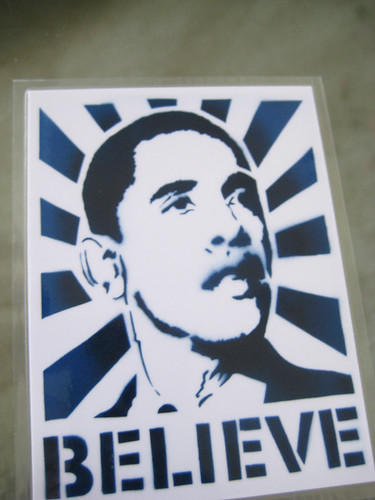
    A show of New Deal art called By the People, For the People will be closing this weekend at the University of Minnesota’s Weisman Museum (you can read Julie Caniglia’s outstanding review of the show for mnartists.org). Seeing it a few weeks ago, I was struck by how much the work on display reminded me not of fireside chats and Woody Guthrie ballads, but of the junior Senator from Illinois. I doubt that it was a conscious decision on the part of Obama’s design squad to make explicit references to the aesthetics of the New Deal in his campaign material. But think of that Shepard Fairey poster that looks it like it came right out of an IWW print shop. Think of the explicit references to the American heartland in the campaign’s it’s-a-flag-but-it’s-also-a-farm "O." Even that ridiculous Latin-enhanced faux-presidential seal that the campaign trotted out a few weeks ago (and then promptly retired) bore a strong resemblance to the logos of FDR’s so-called "alphabet agencies" like the NRA, WPA and CCC.

    Throughout the show, I detected a certain philosophical, functional and aesthetic kinship between our era and this one – it’s all easily-deciphered, populist, progressive art-making practices in service of the civic good. I don’t know if it is Obama’s intention to suggest outright that he’s the direct heir to FDR’s high-minded hard-times liberalism (and his detractors would say he’s hubristic enough to do just that). But there is something stirring about his campaign – yes we can! – that owes quite a bit to the outsized optimism of the 1930s, and a lot of that has to do with the aesthetic decisions Obama’s campaign and his supporters have made.

    Much of the work in the Weisman show was created by obscure regional artists working under the auspices of the WPA Federal Art Project, another one of those alphabet agencies that put American artists to work capturing the Great Depression on paper and canvas. I should say rather that many were obscure at the time, and then went on to have very successful careers later. But most did not; most were artists that were paid to do a job well, and went out and did it. As you might expect with work of this nature, it really ran the gamut in terms of quality. Some of it was very staid and workmanlike, some of it was quite distinguished. What was most remarkable about all of it, though, was the uniform clarity and toughness throughout with which the subject matter was depicted.

    The Great Depression battered America in a way that makes our recent economic troubles seem piddling by comparison, but there is a sense to all of the artwork that America is perfectly capable of drawing on its strengths and pulling itself out of unimaginably difficult circumstances. It’s a broad coalition of regular people, too, that will step up to carry out that task, the kinds depicted in the work – miners, laborers, scientists, factory workers, sharecroppers, truck drivers, builders.

    The Weisman show reminds us that artists, too, were a part of that populist coalition. With the death of Jesse Helms this month and all the editorial hand-wringing that has followed regarding the late Senator’s one-man crusade against contemporary art, we forget that artists could ever be a part of a broad-based populist coalition. And yet there they were, being paid to document the troubled times in which they lived and aligning themselves not with the elite and the influential, but with the dispossessed and the downtrodden. Granted, the work they made was not always popular with those Americans it depicted, and the kind of s
    ocial realist art the WPA produced is often bogged down by the struggle between the high-minded principles it espouses and the difficulty and grittiness of the subjects it depicts. But thinking back to those pre-Culture War times and considering that talented artists would be permitted, and even encouraged, to engage in such a dialogue – well, that’s what seems most surprising and satisfying.

    One of the best surprises for me in the show was a photograph of farm laborers by Ben Shahn, the much-admired mid-century painter and printmaker. Shahn was the kind of old-school Brooklyn Jewish left-wing artist that the Obama campaign, for all its talk of inclusion and progress, would probably take great lengths to demographically disassociate itself with – too radical, too East Coast, too "elite"! I’d had no idea Shahn was out there in the field snapping photos for the Farm Security Administration, but there he was, right next to Dorothea Lange and Edward Weston. Would an Obama administration give a contemporary Ben Shahn, an artist with demonstrably leftist sympathies, the opportunity to get out there into the heartland and create art? Would a contemporary Ben Shahn even want to undertake such an endeavor? Hell, are there even any artists left in his adopted neighborhood of Williamsburg making political art?

    Obama’s campaign has been a fascinating one to watch. At times I have felt (a) like it seemed too good to be true, (b) like it was the true last hope for whatever might be salvageable of the American dream, (c) like the whole thing was hopelessly personality-driven and vaguely demagogical, (d) like Obama might be the only major political leader in my lifetime I could get genuinely excited about, and (e) like it was all noble sentiment and erudite speechifying with no real call to sacrifice and action – often all of these confusing sentiments within the space of a week. Many Americans on both ends of the political spectrum also felt the same sort of ambiguity about Roosevelt. FDR’s harshest critics went so far as to decry him as a Fascist, a charge that has recently been unearthed again in two recent books from both the right (Jonah Goldberg’s phenomenally stupid Liberal Fascism) and the left (Nicholson Baker’s elliptical account of the lead-up to WWII, Human Smoke).

    When we look at this moment in time from a purely aesthetic perspective, it seems to me that we’re looking at a mainstream progressive movement that values good artistic practices and welcomes artists back into the fold, for perhaps the first time since the New Deal. In fact, one of the minor planks in Obama’s long-term plans is the creation of an "Artist Corps." Would the Ben Shahns of 21st century Williamsburg clamor to join such a movement for the good of the nation? Before you answer with a flip remark about the callous solipsism of the youth of America, it’s worth visiting this gallery of Obama-specific street art, which runs the gamut between officially-sanctioned campaign iconography and totally wacky guerilla work. Compare it to these beautiful specimens of WPA poster art. Even if Obama’s cult of personality is a bit overemphasized at the expense of the broader issues in much of the newer art, I would say the aesthetic, functional and ideological parallels are readily apparent, and the comparison on all counts is generally favorable. It looks, at very least, like the opening arguments in a long overdue national discussion over what role art is going to play in contemporary political engagement. That’s something worth getting fired up and ready to go about.

  • Lyre

    There are certain works of art the body wholly understands before the mind kicks in with its distancing powers of disembodied detachment and analysis. In the Twin Cities, there is very little art in the public realm — in what we now call "the commons"– that does this. Most public art, strained through the cheesecloth of three or four bureaucracies, is earnestly mediocre, almost by necessity. Much of what wins competitions is "plop art," dutifully commissioned to meet the tithing requirement for one-percent-for-art public building projects.

    I can think of a few exceptions –not many– where viscerally beautiful works have come to see the light of day as public art despite the pitfalls of the commissioning process. One of them is the Heilmaier Memorial Bandstand, by the artist and architect James Carpenter, the bandshell with the saddle-shaped roof of glass on Raspberry Island in the river off downtown St. Paul. Another (right nearby, actually) is the powerful "Floodwaters," the roiling torrents of cast bronze flanking the southern gateway to Harriet Island Park, by Jeffrey Kalstrom and Ann Klefstad. Yet another, a work beautiful against all odds, is one that was never primarily intended as sculpture but turned out to be more compelling to the senses than many things currently called that. It is the new Martin Olav Sabo Bike and Pedestrian Bridge that spans Hiawatha Avenue and the light rail tracks adjacent to it, just north of 26th Street in south Minneapolis.

    The Sabo Bridge, named in honor of the congressman who secured federal funding for the project, is of a type known as a "cable-stayed bridge." Although they employ cables, the mechanics of cable-stayed designs are different from those of suspension bridges like the Brooklyn or the Golden Gate. A display panel on the bike path’s western approach to the bridge explains the design principle. From an engineering standpoint, a cable-stayed design presented the most elegant solution to the problem of spanning six lanes of traffic and two sets of light rail tracks without having to resort to intermediate support pillars in the middle of the road. The design wasn’t imposed on the site; it was inspired by the site’s constraints.

    The first time I saw the bridge was when I drove under it one evening at dusk a few months before it was completed. Its structural logic made itself understood on first sight. I felt it right away in my bones, sensing the forces working through and upon it the way people sense the rightness of the lines of a boat. Every one of the elements, the incredible back-bent mast, the deck, the fanned-out cables, the backstays converging onto bulwarks rooted deep in the ground, gave expression to the insight of the biologist D’Arcy Thompson that "structure is a diagram of forces." The bridge’s structure correlates with something internal, with one’s felt understanding of the structural mechanics of one’s own body. The sensation of it being in some way analogous to the way you yourself are put together tempts me to call the bridge a work of figurative sculpture-abstract, but nonetheless a human-figural representation of the forces and counterforces; metaphorically, of a tug-of-war; a stevedore hoisting a pallet aloft with a block and tackle, a puppeteer, a fisherman casting a fly. It is what it is –a bridge– but it triggers a chain of associations. It arouses the imagination in ways that few works of public art seem able to do, inert with virtue as most of them are.

    Call it a bridge or call it a sculpture, the new Sabo bridge is an inspired work, a piece of lyric engineering in the tradition of such masters of structural music as Santiago Calatrava, Pier Luigi Nervi, Eero Saarinen, and Frei Otto. Its elegantly tapered steel mast, backbent at an angle almost equal and opposite to the angle of its massive, similarly tapered concrete footing below the bridge deck, is a form sprung from the soul of Brancusi. The bridge is a stirring sight as you approach and go under the deck by car or light rail, and it doesn’t disappoint up close, when you walk or ride a bike over it. It is lovingly detailed: the workmanship in the steel and concrete is rigorous and clean, the care of the contractors readable in the panoply of the hardware, in the tensioning turnbuckles, tie rods, and railing cables, in the dramatizing spotlights mounted alongside the protective rubber boots on the ends of the bridge cables where they connect to the deck, in the backstay cables as their sinews converge in massive connectors to the concrete footings on the ground below.


    Cyclists in colorful gear flash across the bridge like shuttles of a loom. The balusters of the bridge railings are shaped with a bend like the mast’s. The railings themselves—the thin tension cables that pass through the balusters–are like the lines of a musical staff. They make the balusters read like the bars on a musical score, and a little like the frets on a stringed instrument, which in a way this whole construct is. The bridge is a lyre, a harp strummed by the wind. Reach over the railing and touch one of the cables that hold up the span. You can feel it thrum.

  • Twinkle, Twinkle, Little Starchitecture

    Art museums are host to two species of rats, those that skulk in the basements, gnawing on the art in storage, and, lower on the food chain, the people who handle the art. “Museum rat” is trade slang for the stagehands, the workers who hump crates of art off trucks at the loading dock, maneuver sculpture into position, hang paintings, set up lights, build pedestals, perpetually paint and repaint the walls of the galleries, and generally do the bidding of the museum’s commandants. Museum rats are the movers, but not the shakers, of the art world. Most of them are artists of one sort or another themselves, which is to say, bust-outs and delinquents in t-shirts printed with the names of bands and film festivals you never heard of.

    During the nineties, I was one of that floating pool of feckless souls in the Twin Cities who get hired when a museum has two weeks to go before the opening of a show and too few hands to get the work done (the custom is to hire you for a stretch but then lay you off before you qualify for benefits or pensions). Most of my employment was at the University of Minnesota Art Museum, which before it transmogrified into the Frederick Weisman Art Museum consisted of a series of grubby galleries and offices strung along the fourth floor corridors of the moldering Northrup Auditorium. When the museum moved to its new quarters in Frank Gehry’s destroyer-class WAM–the crumpled sketch that served as the tuneup for the Guggenheim’s aircraft carrier in Bilbao–I was one of the deckhands, one of the crew who installed the billboard-size works by Roy Lichtenstein and James Rosenquist that hang in the front lobby and gallery of the museum. And it was I who with clammy male hands in white cotton gloves hung Georgia O’Keefe’s Oriental Poppies, said at the time to be worth two million bucks.

    One of Gehry’s early sketches for the Weisman, scribbled on a cocktail napkin and since preserved with the reverence accorded a holy relic, was seized upon by the museum for a logo, hoping with this to create a perception of the place as a hotbed of spontaneously combusting creativity. The with-it acronym, WAM, strives desperately for the same effect—POW! For all that, the place is basically just a gift shop (the first thing you encounter on entering the building) with a small teaching museum attached. Besides teaching students how to make purchases of tasteful gifts and stand frowning thoughtfully before works of art, the Weisman also makes money by hiring itself out as a catering hall for conferences, receptions, yuppie nuptials, etc. Often when I came in to work on mornings after one of these events, the floors of the galleries would be garnished with wet bits of wilted lettuce and little gobs of buttercream from pieces of sheet cake accidentally flipped off paper plates the night before.

    Gehry’s buildings, in my book, are architecture’s version of torn designer jeans. They imply radical experience without actually having to go through it. They gesticulate without it meaning anything. Inside the Weisman, the yawing walls reflect the gratuitously skewed planes and pointless curves of all the tin-snipped bling hung off the outside. In the museum’s carpentry shop, where I worked, the wall is canted uselessly inward; anything as sensible as a plumb wall would have been too mundane. I never measured to be sure, but it always felt like the shop’s longest dimension is the height of its absurdly unusable vertical space. The shop has no windows either—no eyes. . . it was like working inside a dumpster with the lid closed.

    Rhapsodizing over the Weisman when the building opened fourteen years ago, however, critic Herbert Muschamp of The New York Times pronounced the new museum’s galleries “the five most beautiful rooms in the world.” I rubbed my eyes to be sure I’d read this right, but this was before I understood anything about criticism’s contributions to the science of buzz. The process by which a work is pronounced great is compounded of many sidewise glances at what other people think. Gathering mass, the consensus keeps snowballing, burying us in an avalanche of conviction that such and such a thing is so -– it must be. . . someone more important than us said it is.

    It fell, then, to a couple of obscure museum rats, two anonymous art schleppers, to do something to subvert some part of the world’s received wisdom. One lunchtime a few weeks before the museum’s grand opening, they decided to circumvent the curators and put up a favorite work of their own as the very first picture ever to hang in the new galleries. The work was a portrait they’d found —actually a jigsaw puzzle, still wrapped in cellophane–of Barney the Dinosaur, sporting the beret of an artiste, a pallet and brush in his purple mitts. Following Barney’s installation as the museum’s maiden work of art, one of the perps set up a music stand in the middle of the echoing gallery and with great verve proceeded to play a rousing march on his dented old farting tuba. It was the high point of my life at the WAM.

    Now, whenever I bike along the opposite bank of the river, I look across to the Weisman and think of that dinged-up tuba and the wags I used to work with in the building’s lower depths. As it happens, a fenced-off stretch of the riverbank opposite the museum has this past year been serving as a storage lot for some of the violently twisted steel recovered from the collapse of the I-35 W bridge. From its vantage point across the river, the Weisman, a building that itself appears to have been cobbled together from gum wrappers, looks out upon all that contorted steel rusting in the weeds across the river. Last year, Gehry was sued for dereliction after a $300 million research building he did for M.I.T. in 2004 started falling apart a few months after it opened. Before time stole his thunder, the great and terrible Ozymandias declared, “Look on my Works, ye Mighty, and despair,” but maybe what he meant to say was “repair.”

  • Where We Live

    I’ve been living in the same city for a long time. Maybe that’s why I crave the unusual. I abhor cookie-cutter architecture, which is just as prevalent in urban areas as in cul-de-sac suburbia. How many three-story brick condos with railed terraces have you seen constructed in recent years?

    I want buildings that curve, use everyday materials in strange ways, use strange materials in everyday ways, inspire fear, or give me pause. I like to nestle next to Moos Tower on a sunny day, bike under the Guthrie’s blue-black cantilever at night, and duck into that new box buried behind the Walker Art Center that frames the winter sky.

    I also like the dangerous: decrepit structures with peeling paint and collapsed roofs. Walking across the cracked, aging pedestrian bridge at I-94 near Augsburg College-with cars buzzing on the highway below-makes my heart beat a little faster. Crossing the Lowry Avenue truss bridge is thrilling when you poke your head out the window to look at the Mississippi River’s waves through the steel openings of this 1955 landmark. (Let someone else drive.)

    In choosing pieces for this collection, I was drawn to art that took me away from the everyday: dances, architects, buildings, and photographs of lonely places that lifted my spirits, showed me hidden beauty, or poked my face in decrepitude.

    Originally appeared in issue 19.2 of access+ENGAGE. Subscribe to this free arts e-magazine at mnartists.org/accessengage.

    Pictured Above: Bigelow Chapel Interior – New Brighton, by Joan Soranno
    This is a delicate building by a rising star in architecture. At Bigelow Chapel, Soranno uses five wavy curves to create a cocoon-like atmosphere for worshippers. Soranno also designed the Barbara Barker Center for Dance at the University of Minnesota and the much-heralded University of Alaska Museum of the North in Fairbanks, Alaska, and is now working on the B’nai Israel synagogue in Rochester, Minnesota.

    Little Jack’s (from the Cream City series), Colin Kopp
    I love this Colin Kopp photo. It’s vaguely reminiscent of Donnie Brasco, that Johnny Depp-Al Pacino film where the undercover FBI agent and the gangster bond. And it takes me directly to an imperfect part of Minneapolis that I love: Northeast. Moss clings to the parking barrier like lost hope. The slightly opened hood of the car suggests abandonment. The white washed wall of Little Jack’s covers graffiti and a glorious past.

    Railroad Car #1, Burlington, VT, 2005, by Robert Roscoe
    It would seem easy for a preservationist to fetishize cupolas and other architectural details from decades past. Instead, Roscoe focuses on beauty in unexpected, even dilapidated, places.

    House/Home by Maggie Bergeron
    House/Home is that rare dance that works as both a story and as a metaphor. Five dancers wearing greens and browns snuggle, curl, and finally break away from their four tiny on-stage homes. Throughout the work, they return to their homes, attempt repairs, crush them and start fresh, share them with a lover/friend, push away the lover/friend, and begin again. The dance, a new work by up-and-coming choreographer Maggie Bergeron, shows our connection and disaffection with our surroundings (and our lives), expressed by a continual need to remake, remodel, and reuse. Performed in the Soranno-designed dance center at the U of M.

  • The Genie and His Decorative Light-Diffusing Novelty Lamp

    For a guy who spends all year thinking about Halloween, Will Niskanen could hardly be described as scary. Slight and soft-spoken, dressed in khakis and brown loafers, and exhibiting the good manners of a Boy Scout, Niskanen greets me at one of his favorite haunts, Mill City Cafe, pulling out a chair and offering to order a beverage. His studio is just upstairs, so the café is a great place to take a break from sketching skulls and spiders and tombstones.

    Like several of his neighbors in the California Building, Niskanen is a graduate of the Minneapolis College of Art and Design. What’s rare is the fact that, at age forty-two, after years of “farting around,” he’s gotten to that enviable place of doing exactly what he wants to do. He’s not selling artwork in galleries, however; instead, his creations have names like the Flickering Flame Genie Lamp, the Skull Wall Candle Sconce, and the Flaming Skull Sconce—the last, a popular seller at Spencer Gifts.

    So how did a nice Finnish boy, raised on a Carver County farm, wind up inventing glow-in-the-dark geegaws, light-up novelties, and flaming decorations? Or maybe the better question is, why?

    Part of the answer can be traced back to that rural childhood. Niskanen’s dad, who was a forester with the Minnesota Department of Natural Resources, bought a run-down dairy farm in 1964, when Niskanen was a one-year-old. “He was really into preservation,” Niskanen said. “I think he bought this farm to try out a bunch of his ideas. My parents went to work picking up all the trash and renovating the barn. We had a horse, we had tractors, eighty acres of corn and soybeans. We always bailed hay. You always have to do that in the middle of a hot, hot day.” The elder Niskanen was also “a real disciplinarian,” his son said. “When we were kids, we all had crew cuts. My dad had a very firm idea of right and wrong.” And on a nice day, said Niskanen, if the kids were inside watching television, “he’d come in and pull the plug and wrap it around the TV.”

    That’s how young Will came to spend a lot of his time tinkering in the barn, using the shop equipment and hand tools to build everything from birdhouses to an elaborate train set, which he assembled in the barn’s loft. Tucked away in the country and on a limited budget, Niskanen had to create all the model-train accessories other kids might buy at a craft store. “I wanted so bad to go into town for more track,” he laughed, “but I couldn’t, so I thought, well maybe I can make it myself. I got a book to learn how other people made their mountains, and I made the mountains out of plaster. Because I lacked a lot of the cool mechanical devices you could buy, it ended up being a lot more scenery. Lots of tunnels and trees made out of weeds,” he said. “I learned how to solder, cut wood, do some carpentry, paint a background.” All of this fostered in him “a sort of self-reliance,” said Niskanen. “My first response when my car breaks down is probably to fix it myself. Most things in my life are like that.”

    Which brings us back to the present, in Niskanen’s modest and currently cluttered studio, where self-reliance has inspired an entire series of odd, glowing contraptions. A purple tube that vaguely resembles a lava lamp is throwing light against a black backdrop. Next to it is a gray light that looks as if smoke is wafting through it. A smaller orange light nearby is meant to sit inside a pumpkin. These are all products born of Niskanen’s pride and joy: U.S. Utility Patent 6,955,440: Decorative Light-Diffusing Novelty Lamp and the mechanical process it employs. For someone accustomed to tinkering and inventing and dealing with a constant flow of new ideas, the patent-application process was a sort of Zen teacher, a lesson in patience and detachment.

    Showing off his official U.S. patent certificate, Niskanen clucks over it like a new parent whose offspring arrived after a difficult delivery. “The whole patent process is this back-and-forth thing of denial and rejection,” he said. Despite all of the labor involved, he said he hopes to have “six or eight of these things someday.” Sitting down at his desk, he read choice passages from the patent, which he finds amusing for their colorful, sometimes titillating language; the wording must be absolutely precise while also addressing the object’s unique contribution to the world of gadgetry.

    “‘Novelty lamps have been used for years to provide entertainment and relaxation to persons throughout the world,’” he read, nodding. “‘For example, many persons are familiar with lava lamps, which by heating blobs of material, induce the material to change buoyancy and thus float and sink within a liquid bath. Sometimes, the blobs are colored.’ Don’t you love it?” he pauses, looking up. “Blobs!” He continues reading.

    “‘Sometimes the blobs may have different colors. The appearance of the floating and sinking globs’—Ha! Now it’s globs!—‘may be further enhanced by the casting of light upon the blobs. In any event, novelty lamps such as lava lamps often induce dangers to the environment.’”

    The various hazards produced by hot and blobby lava lamps were key to Niskanen’s invention, which is seen as a safe alternative for dorm room and bedroom decor. The Decorative Light-Diffusing Novelty Lamp, stripped to its essential bits, consists of a stand, a lightweight fan, a plastic tube, and a piece of silk that Niskanen mentions is officially referred to in the patent language as the “flexible member,” one of those terms that cause him to chortle. It is scheduled for mass production and distribution in 2007, and Niskanen is already building out variations, such as the smaller lamp for jack o’ lanterns, a light-sword toy, and a “wave panel lamp junior” for nightstands. He also envisions a much larger version of the lamp, one that would wave light six or eight feet high and create a cool atmosphere at proms and nightclubs. And there are all sorts of other things in the works. Niskanen is developing “yard luminaries”—those sandwich-board-style decorations with a design cut into the panels, which are lit from within—for all seasons and occasions, including, of course, Halloween. Those versions have waving green, orange, and red lights behind cutouts of a spider’s web, or a witch, or a pumpkin. “For some reason right now, I’m into things that light up,” he said. “And things for parties.”

    Musing over how he came to be an inventor of Halloween novelties, Niskanen noted it’s not necessarily something that he always wanted to do. “It just happens to fit,” he said. “All of the things I’ve done have sort of led me to this place. I’m a late bloomer, I guess.” He received no encouragement from his high school art teacher, whom Niskanen describes as “a load, a real turd.” Luckily, the faculty at MCAD recognized his talent, and he received a first-year scholarship to attend. He particularly admires one teacher who, in Niskanen’s early years at the college, stressed craftsmanship. “He would say, ‘If you’re going to weld on that chair, you better make that weld nice. If you’re going to paint that chair, you better paint it right. If you’re going to do it, do it well.’ Old-fashioned stuff. Do it well; distinguish yourself.”

    That approach was a good fit for the self-reliant Niskanen, who was interested in art’s practical applications. “Even when I was going through MCAD, I knew I had this interest in industrial design, and I had kindergarten knowledge of mechanics, but I didn’t know how to join the two in the real world. I had a good basic drawing skill, but I didn’t know how to apply it.”

    After graduation, he worked for a time designing props for Minneapolis’ Minnefex studio. He lived in Des Moines and worked as an illustrator for a woodworking magazine. After a few years, he found himself in Litchfield, sketching cabs for a construction-equipment company. Then he joined Paper Magic Group, a company that specializes in seasonal decorations and set Niskanen to the task of sketching new Halloween products. “I became a pollinating honeybee for ideas, so to speak,” he says. Soon he began to deal more directly with the buyers, and after a time he noticed he was selling himself short. “They’ve done very well with a number of the things that I designed,” Niskanen said. “I was offering all of this energy and creativity to the company.” And that’s when he decided to pursue his own patents and license his own products.

    These days, Niskanen’s creative process usually begins with sketches for a product. Then he’ll go through a period where he roots around at garage sales and Salvation Army and Goodwill stores. He might browse craigslist for a while, looking for electronics (especially old hi-fi gear) and items under the garage-sale or “free stuff” categories that sound intriguing. Then he’ll go get a coffee or wander the seasonal-product aisles at Target. His studio is littered with spray-paint cans and boxes upon boxes of detritus from his foraging trips: plastic parts from computers, hair dryers, and abandoned kitchen gadgets. He uses all of these in building three-dimensional models of his ideas so that potential buyers and Steven Thrasher, his patent attorney, can better envision the finished product.

    “Will has this unique combination,” said Thrasher, “of combining engineering competence with artistic creativity. But the most interesting part of Will’s story, I think, is his persistence. My granddad once said he spent ten years becoming an overnight success, and Will’s like that—he’s an inspiration to people who are just beginning to follow their passion. And he’s an easy guy to root for.”

    In a sea of Spider-Man costumes, Styrofoam gravestones, and fake Dracula teeth—Halloween is second only to Christmas in terms of consumer purchases, generating several billion in sales each year—Niskanen has managed to carve out his own niche. Last spring, at Transworld’s 22nd International Halloween Costume & Party Show in Chicago, he was gratified by the excitement his pieces generated. “Each time I do a show, I walk around and there are few new ideas. I see a product sometimes and think, Well, that’s great, but they missed the cool thing, the cool thing they could have done with it. “I don’t look at Halloween the way a normal person does,”

    Niskanen said. “When Halloween actually comes, I don’t really participate.” Instead, you can probably find him browsing store displays, trying to figure out the next cool thing to do.

  • Cabin For the Uncommon Man

    "Log cabins are a dime a dozen,” said Richard Olson, lighting up yet another Marlboro. “We looked at some of those. They were junk. They were put together by amateurs. Some of the logs had separated; you could see right through them. All these trees here, tip some of them on the side, and you’ve got a log home … logs, logs, logs.” A suggestion is put forth: Is a log home in the woods, well, redundant? “Yeah,” he agreed, clanking his spoon around in his coffee cup, “something like that.”

    Richard was sitting with his wife Debbie on the patio of their cabin in the woods, a couple of miles from Ely. This is certainly no nostalgic log structure, but rather a striking example of modernist simplicity and Scandinavian restraint. It’s actually a one-level ensemble of buildings: a garage and a two-part cabin, composed of a square and a rectangular form, all dressed in a very un-cabin-like blue-black stain. Situated across the patio from one side of the living-room end of the cabin is a white brick “unchimney,” or flueless outdoor fireplace—a design signature of the home’s architect, David Salmela.

    When the Olsons bought the cabin, on a wintry St. Patrick’s Day six months ago, they had never heard of Salmela, despite his international reputation and local celebrity. They certainly would not have considered themselves design aficionados. Nor were they necessarily the kind of buyers that Salmela and developer Brad Holmes, from Gilbert, Minnesota, had in mind. (Holmes has built sixteen of Salmela’s residential designs over the years, including Ravenwood, photographer Jim Brandenburg’s compound at the edge of the Boundary Waters Canoe Area Wilderness.) Yet Richard and Debbie Olson’s immediate attraction to the cabin speaks to the broad appeal and understated artistry of this simple, small, and modestly priced project.

    The Fergus Falls couple discovered the cabin while searching the Internet for a vacation home; it was the first of five to be completed in a development owned and planned by Holmes. Richard Olson drove over, had a look, and purchased it immediately. “I didn’t analyze it when I bought it. I just liked it,” he said. “When you drive up to this place, it says, ‘I’m separate and distinct from the surroundings.’ I like that it’s different. It’s not something everyone has.”

    Lake access is not something every cabin has, but it’s an amenity many second homeowners in Minnesota automatically associate with “cabin.” The Olsons, however, prefer their wooded seclusion. “We can drive out of here in any direction and be on the water. There’s water all over here,” Richard pointed out. “But if you’re on the water, you’re next to someone. It’s like living in an apartment. There’s no privacy.”

    Unlike the other cabins he looked at, Richard continued, this one is “solid, well-built. You could tell that the minute you walked in. The place is super insulated, with all the latest technology. Everything is done correctly, the way houses used to be built.” He also enjoys the novelty factor of Salmela’s architecture. “Everybody that comes in here says, ‘Wow.’ An old guy picked up my lawn mower the other day and said, ‘I had no idea this was down here. What is this?’ I had to explain it all to him. He just shook his head. He’d never seen anything like it. That’s what I like about it.” Built in 1995, Ravenwood is a cluster of living, working, and studio structures, which Salmela designed to accommodate the needs and desires of Brandenburg, arguably the country’s foremost living nature photographer. In the book Salmela Architect, published earlier this year, author Thomas Fisher describes this six-thousand-plus square-foot complex as “an ancient Scandinavian village, forgotten deep in Minnesota’s northwoods, as if the past had taken a quantum leap forward into the present.” After building Ravenwood, Holmes was inspired to take a somewhat entrepreneurial approach to residential development. He wanted to undertake a project in the Ely area that involved smaller, year-round homes—homes that would be designed by Salmela without input (or interference) from clients.

    “I wanted to enjoy building something with just me and David,” said Holmes. “The way he uses light with all of the windows, you feel like you’re outside among all those beautiful trees when you’re inside. David knows how to do that in every project.” Holmes purchased a wooded property outside of Ely and divided it into five seven- to nine-acre lots. He then planned to build the cabins one by one, in his spare time. He asked Salmela to design a low-profile dwelling that “looks like it’s been there in the woods for a hundred years,” he said. “Everybody wants those huge log cabins. I told him, ‘Let’s try something different.’” Salmela agreed. The architect drew up the cabin design, which totals fewer than a thousand square feet, and in exchange, Holmes built wardrobes and cabinetry for Salmela’s own home that are similar to those in the Ely cabins. The Olsons bought the prototype cabin for $195,000; a month later, a younger couple bought the second for $185,000 (it’s the same plan as the first, but flipped, and it has no built-in furniture or exterior stain).

    With its lap siding and a wood truss projecting from beneath the slightly peaked metal roof, the Olsons’ cabin recalls houses lined up along a picturesque seacoast in Norwegian travel brochures. The trio of structures—the garage and the two cabin components—were all built using fourteen-foot trusses. The garage is large enough to accommodate racks of canoes or a sauna, while the main living/dining/kitchen space is a modest fourteen by twenty-four feet. A wood-plank walkway connects the garage to the living space. Visible outside the floor-to-ceiling windows is the patio, with its pergola and unchimney. The other “wing” of the cabin is situated off the kitchen, where a long corridor links a series of simple, square rooms—sleeping quarters, bathroom, and laundry room.

    This compound-like arrangement is found in much grander manifestations throughout Salmela’s work, from Ravenwood to the planned community of Jackson Meadow, outside Marine on St. Croix (which Salmela designed in collaboration with the Minneapolis landscape architecture firm Coen & Partners). In his book, Fisher describes the arrangement of homes, garages, fences, and walkways in Jackson Meadow as “recalling the small yards of historic towns”—an effect present in his Ely cabin design, albeit on a much smaller scale.

    The cabin has other Salmela markers, as well, such as a string of square windows marching along the exterior of a long, narrow form, which is also found in the Jackson Meadow homes, the Wild Rice Restaurant near Bayport, Wisconsin, and at the Jones Farmstead near Nerstrand. Another characteristic is the blurred distinction between inside and out. The feeling of being outdoors while inside the home is such that the Olsons can watch fires in the unchimney from inside the cabin, as well as from the patio.

    While Salmela’s work has a distinctly modern feel, it’s far too traditional, despite being occasionally whimsical, to fall into the modernist camp. “This is what I perceive modernism to be today,” said Salmela, sitting in the office he keeps in his 1920s home on a hill in Duluth, surrounded by awards, publications, models, and drawings. “It’s the warmth of things you’re familiar with, like forms and materials, and the planning and efficient way a structure goes together. It doesn’t have to look super modern, like the minimalist things done to prove they’re really modern. I’m trying to use common sense about how something goes together. These cabins are so easy to build, so simple when you look at them on paper, that you can’t perceive there’s anything really unique about them.”

    The architect tore a length of tracing paper from a roll and started sketching squares and rectangles. “See, it doesn’t look spectacular,” he said, “and the chimney isn’t very high.” At twelve feet, unchimneys at the Ely cabins are shorter than the monumental versions at the Wild Rice Restaurant or the Golob-Freeman cabin, also known as “Two Black Sheds,” on Madeline Island. “But when you start to build, this becomes quite dynamic.” The forms, windows, and walls are both functional and visual devices, he adds. The metal roof, wood siding, and outdoor fireplace recall the vernacular of the northwoods. Salmela alludes to his own heritage in suggesting that the cabin “looks like 1960s Finland. It’s really a very pure, straightforward, mid-modernist era structure, with no pretension.”

    For Salmela and Holmes, the cabin is also an experiment in creating ready-made architecture. All a buyer needs to bring are the essentials of daily living: bedding and towels, groceries, kitchenware, clothes, sports gear. Included with the cabins are appliances and cabinets, a built-in couch (whose angled cushions, when flipped, make a guest bed), a wood dining table (the Olsons bought their own chairs), slate floors, and built-in beds and wardrobes. “Traditionally, cabins are a lot of work,” Salmela said. “Here, everything is already done for you, and in a more sophisticated way.” Of course, there’s also the added cachet of purchasing a cabin designed by a noted architect, one whose star continues to rise, without paying an architectural fee.

    And the wooded, lakeless setting? “Canoers don’t need to be on a lake, because if you’ve got your canoe, you can go anywhere you want,” Holmes says. “We figured not being on a lake wouldn’t be a problem.” Buyers of the cabins, Holmes and Salmela concur, would get out their boats every day, venture to a different lake to paddle, then return home to read, relax, work, and have a fire. These expectations imply a certain type of buyer, as well. “The concept, from my standpoint as a designer, was to create an affordable, environmentally sensitive, development, with a simple, modernist set of structures that satisfy the needs of people living outside the area, within a natural setting of woods—versus being on a lake—that becomes a statement in itself,” said Salmela.

    However, the five-cabin development, as originally envisioned, may not become fully realized. A few months ago, a man from the Twin Cities called Holmes about purchasing one of the lots. “I told him I’m not selling, because I’m doing five cabins in there,” Holmes says. But the caller was persistent. “So I threw out a ridiculous price and he didn’t blink an eye. I didn’t know what to do. I guess in the long run, money talks.” The lot’s buyer hasn’t decided whether or not he’ll construct a Salmela cabin. “It’s the lot on the far end,” says Holmes, implying that he minimized the potential for the development’s disruption. “The other four are still grouped together.” Nevertheless, the sale threatens the pair’s architectural experiment.

    “It’s a neat idea,” Salmela said of the Ely cabin development, “but the odds of it succeeding are a long shot. It’s necessary to have a continuity to complete these things. If you break it, you can’t repair it. That’s the experiment. Brad knows he needs to keep an integrity to the project. But does he have the perseverance? If we can’t get beyond the two cabins, then we say the notion was good, but it was a concept that failed.”

    Then there are the Olsons, who don’t fit the yuppie environmentalist type of buyer that Salmela and Holmes had in mind. Richard is a gruff, gravel-voiced, chain-smoking retired business representative for the Machinists Union. Debbie works as a bookkeeper in a plumbing store. They don’t own a canoe or kayak. They’re not likely to bring laptops or copies of Dwell (which recently put a Salmela home on its cover) along on weekend visits. And in an artful pile of rocks behind the unchimney, Richard has “planted” bouquets of silk flowers, a decorative statement that Salmela calls a “major violation.”

    Richard was quick to justify his décor. “My wife hates them. But I’m colorblind, so to me it’s colorful.” Besides, he added, the floral facsimiles won’t be there forever. “We’ve got stuff planted,” he said with a huff and a sigh. It’s entirely possible that the fake flowers are a sign of Olson reveling in his own irreverence, making use of his relentlessly wicked sense of humor in a place he was immediately attracted to but had never imagined living in before—a place he now appreciates on a deeper level, especially after reading up on architecture (including Fisher’s book on Salmela) and spending the summer there.

    The Olsons clearly are enamored with their cabin, which is otherwise free of decoration inside and out. Debbie tells of waking up to deer peering through the floor-to-ceiling bedroom window and her delight in low kitchen cabinets that don’t intrude on outdoor views while preparing meals. They keep their eyes peeled for foxes and chipmunks. And they love firing up the unchimney; Richard especially enjoys the reactions from visitors who’ve never seen the cabin. “Strangers came in one day to buy something I was selling and thought the unchimney was a giant refrigerator!” he says. “People don’t believe it will work. But it does work. It works beautifully.”

  • Fashionable Ideals

    On the surface, Armi Ratia and Lilly Pulitzer have a lot in common.
    Both women got their start in the 1950s and became famous for producing
    fabrics printed with bright colors and bold graphics. Both had a
    spirited, playful appeal—Pulitzer had her kitschy duck and turtle
    patterns, and Ratia named her company Marimekko, which translates from
    the Finnish as “little Mary dress.” And Jackie Kennedy brought a jolt
    of publicity to both labels when she turned up in magazine features
    wearing their dresses.

    But in deeper ways, Ratia was the thinking woman’s Pulitzer. The latter
    was an eccentric New York socialite who got into the apparel business
    in the late fifties, after friends became smitten with the uniforms she
    made for workers at her juice shop in Palm Beach. Ratia, however, was
    ambitious from the start, a charismatic art director whose business
    sense was as sharp as her eye for talent. In 1951, when Finland was
    still emerging from the shadow of World War II, she was looking to make
    her mark in the male-dominated design world—and did so in large part by
    banking on inexperienced women fresh out of design school. She was also
    looking back to modernist “gesamkunstwerk” ideals like Germany’s
    Bauhaus movement, where designers of all kinds came together to apply
    their individual talents to a larger, progressive, even utopian vision.
    (Nevertheless, as with so many designer objects touted for their
    accessibility, Marimekko was and is relatively exclusive—Old Navy it
    ain’t.) 

    These days, with companies like Target bringing “good design” to the
    masses, it’s difficult to imagine how radical Marimekko was at its
    inception. During a time when staid florals dominated Finnish textiles,
    Maija Isola, one of the company’s first and most famous designers,
    began turning out idiosyncratic figurative patterns and large-scale
    abstractions of stones, birds, and leaves. Like her compatriot, the
    architect Alvaar Aalto, she borrowed from Finnish folkloric traditions
    while simultaneously blazing modernist trails. Then there was the cut
    of Marimekko clothing. Even as Christian Dior’s wasp-waisted postwar
    “New Look” was spreading internationally, Marimekko became possibly the
    first label to put forth an “anti-fashion” message with the designs of
    Vuokko Nurmesniemi. Aiming to create clothing to accentuate the
    wearer’s personality rather than her figure, Nurmesniemi’s voluminous
    shapes and simple lines were also well suited to Marimekko’s
    large-scale patterns.

    Marimekko: Fabrics, Fashion, Architecture, which is on view at the
    Rochester Art Center (through August 20, 507-282-8629), traces the
    evolution of Marimekko through the sixties, seventies, and on up to its
    present-day revival. Interestingly, among all the suspended fabric
    swaths and lovely, covetable dresses, it’s the video montage of
    publicity and industrial footage that speaks most clearly about
    Marimekko’s fresh, fun, and decidedly quirky sensibility. One
    especially piquant segment shows a gaggle of rosy-cheeked,
    Marimekko-clad youths cavorting on a rocky Finnish seashore. They
    gather in a circle and, laughing all the while, pass around a massive
    goblet of orange juice as a toast to clean living and tasteful
    clothing.—Julie Caniglia